Color theory is the collection of rules and guidelines which designers use to communicate with users through appealing color schemes in visual interfaces. To pick the best colors every time, designers use a color wheel and refer to extensive collected knowledge about human optical ability, psychology, culture and more.
Understanding Color
Color is perception. Our eyes see something (the sky, for example), and data sent from our eyes to our brains tells us it’s a certain color (blue). Objects reflect light in different combinations of wavelengths. Our brains pick up on those wavelength combinations and translate them into the phenomenon we call color.
When you’re strolling down the soft drink aisle scanning the shelves filled with 82 million cans and bottles and trying to find your six-pack of Coke, what do you look for? The scriptedlogoor that familiar red can?
People decide whether or not they like a product in 90 seconds or less. 90% of that decision is based solely on color. So, a very important part of your branding must focus on color.
Types of Colors
Sir Isaac Newton established color theory when he invented the color wheel in 1666. Newton understood colors as human perceptions—not absolute qualities—of wavelengths of light. By systematically categorizing colors, he defined three groups:
Primary (red, blue, yellow)
Secondary (mixes of primary colors)
Tertiary (or intermediate – mixes of primary and secondary colors)
Following Newton’s findings, the study of color advanced to cover the properties of color in its two forms—i.e., print/paint and screen/light—and in a variety of fields, from art to astronomy. A color’s properties are:
Hue – How it appears (e.g., “is green”).
Chroma – How pure it is: i.e., if it has shades (black added), tints (white added) or tones (grey added).
Lighting – How pale or saturated it appears.
Newton's Color Wheel
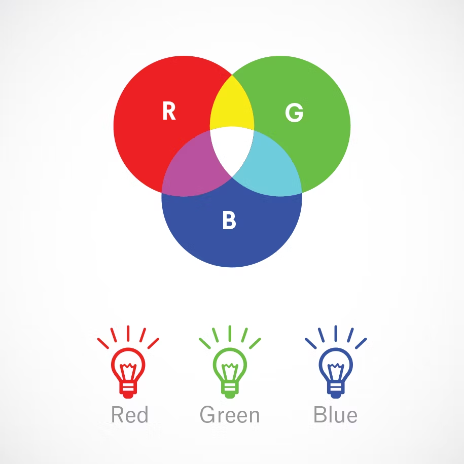
RGB: the additive color mixing model
Humans see colors in light waves. Mixing light—or the additive color mixing model—allows you to create colors by mixing red, green and blue light sources of various intensities. The more light you add, the brighter the color mix becomes.
If you mix all three colors of light, you get pure, white light. TVs, screens and projectors use red, green and blue (RGB) as their primary colors, and then mix them together to create other colors.
Importance: Let’s say you have a very distinct brand with a bright yellow logo. If you post the logo on Facebook, Twitter or your website and don’t use the correct color process, your logo will appear muddy instead of that bright yellow. That’s why, when working with files for any screen, use RGB, not CMYK.
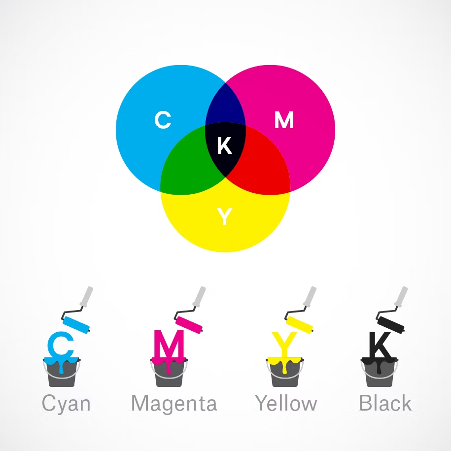
CMYK: the subtractive color mixing model
Any color you see on a physical surface (paper, signage, packaging, etc.) uses the subtractive color mixing model. Most people are more familiar with this color model because it’s what we learned in kindergarten when mixing finger paints. In this case, “subtractive” simply refers to the fact that you subtract the light from the paper by adding more color.
Traditionally, the primary colors used in subtractive process were red, yellow and blue, as these were the colors painters mixed to get all other hues. As color printing emerged, they were subsequently replaced with cyan, magenta, yellow and key/black (CMYK), as this color combo enables printers to produce a wider variety of colors on paper.
Importance: You’ve decided to print a full-color brochure. If you’re investing all that money into your marketing (printing ain’t cheap!), you expect your printer is going to get the colors right.
Since printing uses the subtractive color mixing method, getting accurate color reproduction can only be achieved by using CMYK. Using RGB will not only result in inaccurate color, but a big bill from your printer when you’re forced to ask them to reprint your entire run.
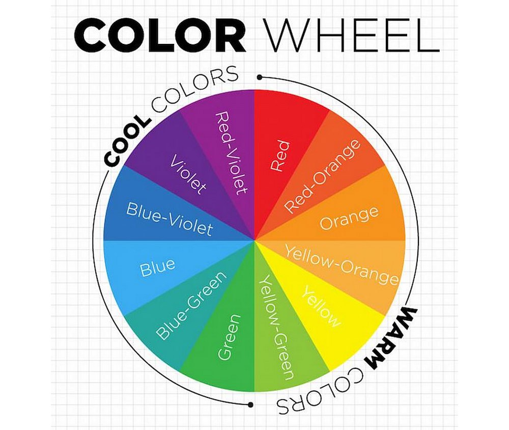
The Color Wheel
The easiest way to understand what color theory is all about is to take a quick look at the color wheel. It’s the rules set by the color theory that helped create the color wheel.
The color wheel we use today is a version of the original concept of the circle of color created by Sir Isaac Newton. A quick look at this color wheel is enough to understand how its three main colors (Red, Yellow, and Blue) creates the rest of the colors in contrast to each other.
Then there are the secondary colors, (Green, Purple, and Orange), that are made when the three main colors are mixed. Followed by the rest of the six Tertiary colors that are made from a mix of primary and secondary colors.
The color wheel can also be divided into 2 main types of colors— warm colors and cool colors. When you split the color wheel into two slices you can clearly see these two types of colors in the left and right sides with warm colors and cool colors.
Understanding the difference between warm and cool colors will help you create designs that are appropriate for your brand and audience as each type is associated with different values and ideas.
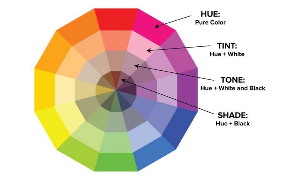
Important Color Terms
The color wheel is only the foundation that you can use to create more extensive and advanced color palettes. Here are the bases of color, or the terminology, you should understand to apply the color theory when creating color palettes.
Hue: Hue is the base color and nothing more.
Chroma: Chroma is the color in its purest form.
Saturation: The vividness of the color.
Shade: When you add back to a hue it creates a shade.
Value: Value refers to the darkness or the lightness of a color.
Tint: Adding a certain amount of white to a hue creates tint.
Tone: Add some gray to a hue to create tone.
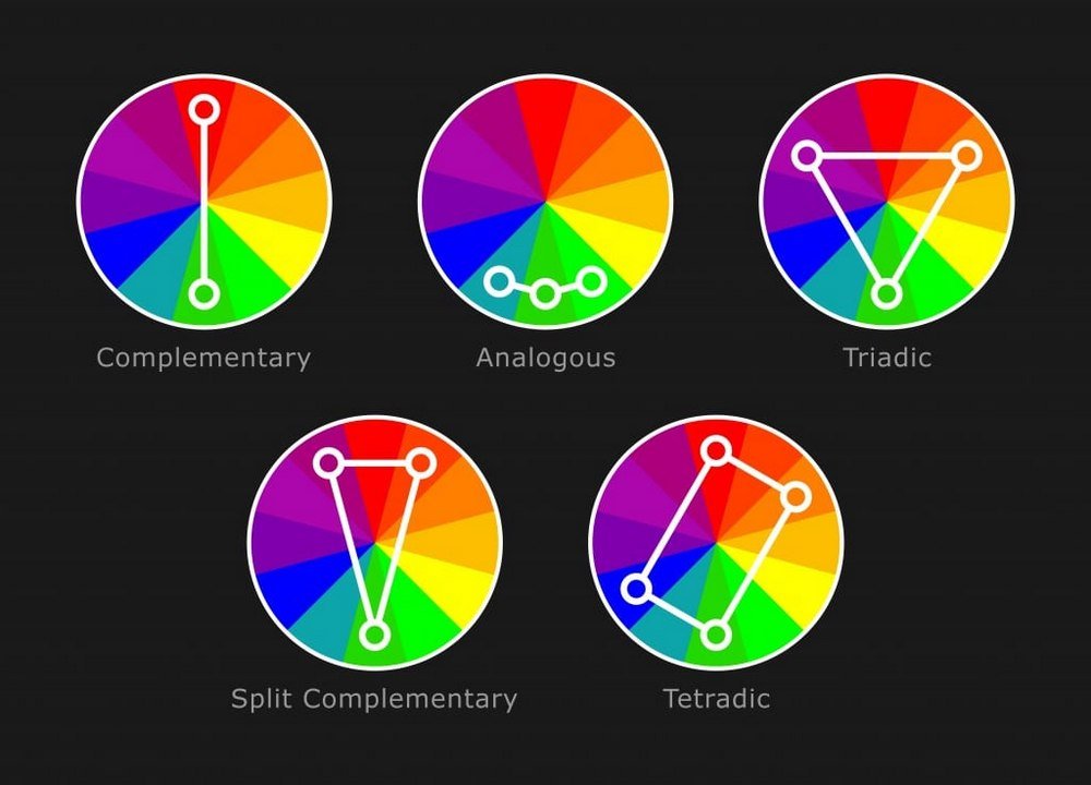
The 4 Main Color Schemes
Well, there are actually more than 4 color schemes out there, but for purposes of understanding, we wanted to briefly explain the 4 main color schemes used in design.
These are the main color schemes you can use as the base for your color palette when designing different web and graphic design projects.
Complementary: Complementary colors refer to the main colors that stand opposite to each other on the color wheel. You can add tint and shades to create unique color palettes using a complementary color scheme.
Analogous: Analogous color schemes to use the main colors right next to each other on the color wheel. This type of color schemes are quite vivid and are most suitable for casual and consumer brands.
Monochrome: Monochrome color scheme uses different shades of a single main color. This is one of the most difficult color schemes to implement in a design. But when you find a way to create a monochrome color scheme, it usually looks quite elegant.
Triadic: Triadic color schemes consist of colors that stand at the same distance to each other. This type of color palettes are mainly used in modern art and paintings and doesn’t look very pretty in digital and graphic designs.
The Psychological Effects of Color
Why is color such a powerful force in our lives? What effects can it have on our bodies and minds? While perceptions of color are somewhat subjective, there are some color effects that have universal meaning.
Colors in the red area of the color spectrum are known as warm colors and include red, orange, and yellow. These warm colors evoke emotions ranging from feelings of warmth and comfort to feelings of anger and hostility.
Colors on the blue side of the spectrum are known as cool colors and include blue, purple, and green. These colors are often described as calm, but can also call to mind feelings of sadness or indifference.
How do people respond to different colors? Below are the detailed descriptions behind the psychology of each color.
The Color Psychology of Black
Black isn't a primary, secondary, or tertiary color. In fact, black isn't on the color wheel because it isn't considered a color. It's all colors. Or rather, the absorption of all colors. Black absorbs all light in the color spectrum.
According to color psychology, color-related emotion is highly dependent on your personal preference and past experiences with that particular color. The color black is no different.
Illustration by Cindy Chung, VerywellThe Psychological Effect of BlackIndividual reactions to the color black can vary widely. According to German scientist Hermann von Helmholz, "Black is real sensation, even if it is produced by the entire absence of light. The sensation of black is distinctly different from the lack of all sensation."
Positive Associations
For some, black evokes positive associations with this color, including attractiveness and elegance. The color oozes sophistication. That’s why so many people choose to don black clothing when attending a fancy event. It’s also why high-end brands like Tiffany & Co. and Chanel utilize black in their logos.
When it comes to high society, the color black has long been associated with power. From priests to judges, tuxedos to credit cards. And let’s not forget about Steve Jobs.
Negative Associations
However, many use the color black to symbolize all things negative. Throughout history, this somber color has been tied to death and all things evil and bad. It evokes strong feelings of anger, aggression, fear, and sadness.
The connection between black and negativity is probably most clearly seen in our language. Just consider these commonly used expressions: Black Monday. Black Plague. Black magic. Blackball. Blackhole. Black-hearted. Black mood. Black sheep. Blackmail. Black market. Blackout. The list could go on.
And nothing says "bad guy" quite like the color black. Though black is worn (and often preferred) by people from all walks of society, it's often seen as the stereotypical color for criminals and villains. Why do you think the color of choice for villains (think Dracula and Darth Vader) and other shady movie and TV show characters is almost always black?
Black is the perfect example of how color meaning can differ from one culture to another. In many western traditions, black is associated with death and mourning, whereas in China the color of death is white.
The Color Psychology of White
Does this image make you feel inspired or refreshed? or does it leave you feeling cold and lonely? Many people find white serene and pure, while others feel that it's stark and cold.
Color Associations Are Not Universal
One thing to remember is that such color associations are not necessarily universal. Colors can have different meanings, symbolism, andassociations in other cultures.
In Western cultures, the color white is often associated with weddings, hospitals, and angels and is often used to convey a sense of purity, cleanliness, and peacefulness.
In many Eastern cultures, however, white is symbolically linked to death and sadness. It's often a color used in funerals and other mourning rituals.
The Color Psychology Characteristics of White
According to color psychology, these are the characteristics of white:
White represents purity or innocence. While a bride wearing white was often thought to convey the bride's virginity, blue was once a traditional color worn by brides to symbolize purity.
White is bright and can create a sense of space or add highlights. Designers often use the color white to make rooms seem larger and more spacious.
White is also described as cold, bland, and sterile. Rooms painted completely white can seem spacious, but empty and unfriendly. Hospitals and hospital workers use white to create a sense of sterility.
Some of the positive meanings that white can convey include cleanliness, freshness, and simplicity. The color white often seems like a blank slate, symbolizing a new beginning or a fresh start.
On the negative side, white can seem stark, cold, and isolated. Consider how a large, white, empty room might seem boring, bland, and stark.
The Color Psychology of Red
In color psychology, red provokes the strongest emotions of any color. While cool colors like green and blue are generally considered peaceful and calming, red is considered the warmest and most contradictory of the colors. In fact, this fiery hue has more opposing emotional associations than any other color: Red is linked to passion and love as well as power and anger.
Below are some of the most common feelings and qualities that the color red can stimulate.
Verywell / Cindy Chung
Danger and Warning
Thanks to its long wavelength, red is one of the most visible colors in the color spectrum (second only to yellow). Its ability to instantly grab people's attention is the reason why it's often used to warn people of impending danger. Think: stop signs, sirens, fire engines, and red traffic lights.
Red is also used to convey danger in a non-literal way. Some examples include using the phrase "in the red" to describe financial loss or "red flag" to indicate when something is wrong with a person or situation.
People tend to associate red with negative, danger-bearing emotions. This could be because it is the color of fire, blood, and sometimes of poisonous or dangerous animals.
Excitement and Energy
This stimulating color is also associated with excitement.
Studies show that being exposed to or wearing red can cause some of the following physical effects:
Elevated blood pressure
Enhanced metabolism
Increased heart rate
Increased respiration rate
All of these physiological changes naturally cause your energy levels to spike.
The color is also known to increase your appetite by increasing your metabolism, which is why red is such a popular color in restaurants.
Aggression
Across cultures, people intuitively associate red with the concept of anger. This relationship makes sense given that many people get red in the face from increased blood flow when they're angry.
The expression "seeing red" is thought to be based on the physical characteristics associated with anger, including redness of the face and neck, which are caused by elevated blood pressure.
Factors That Lead to Aggression
Dominance
It's not just mood and emotions that the color red can affect. In the arena of sports, wearing the color red can also increase your chances of winning.
In the 2004 Olympics in Athens, competitors in four sports—boxing, Greco-Roman wrestling, freestyle wrestling, and taekwondo—were randomly assigned red or blue clothing. In all four competitions, red-clad contestants won more fights.
Many think these results are due to the link between red and perceived dominance. For instance, donning a red uniform may cause an athlete to feel dominant and perform more aggressively. Alternatively, athletes in red may be seen as more aggressive, more dominant, and more likely to win a physical competition not only by their opponents but also by the referees.
Whatever the reason, it is clear that red-clad athletes tend to have a significant advantage over their opponents. (Maybe this is why so many athletes, including the great Tiger Woods, wear red clothing when they compete.)
Power
Red can also represent power, a relationship that can be found all over modern-day society. The "power tie" worn by businessmen across the globe is, traditionally, red. And don't forget the hallowed "red carpet" that is only rolled out for the most prestigious celebrities and dignitaries.
According to some, this association with power and wealth is the reason why women find men dressed in red so attractive.
The Color Psychology of Blue
How does the color blue make you feel? People have long believed that certain colors can evoke different moods and feelings, and some research has supported the idea that colors can have psychological effects.
Blue is a color often found in nature such as the pale blue of a daytime sky or the rich dark blue of a deep pool of water. It is for this reason perhaps that people often describe the color blue as calm and serene. Yet as a cool color, blue can sometimes seem icy, distant, or even cold.
Illustration by Cindy Chung, Verywell
The Psychology of Blue
According to color psychology:
Blue is described as a favorite color by many people and is the color most preferred by men. Because blue is favored by so many people, it is often viewed as a non-threatening color that can seem conservative and traditional.
Blue calls to mind feelings of calmness or serenity. It is often described as peaceful, tranquil, secure, and orderly. Blue is often seen as a sign of stability and reliability. Businesses that want to project an image of security often utilize blue in their advertising and marketing efforts.
Blue can also create feelings of sadness or aloofness. Consider how a painting that heavily features blue, such as those produced by Picasso during his "blue period," can seem so lonely, sad, or forlorn.
Blue is often used to decorate offices because research has shown that people are more productive in blue rooms.
Blue is one of the most popular colors, but it is one of the least appetizing. Some weight loss plans even recommend eating your food off of a blue plate. Blue rarely occurs naturally in food aside from blueberries and some plums. Also, humans are geared to avoid foods that are poisonous and blue coloring in food is often a sign of spoilage or poison.
Blue can also lower the pulse rate and body temperature. Consider how blue is used in language: blue moon, blue Monday, blue blood, the blues, and blue ribbon.
Blue Feelings
Look at the use of blue in the image that accompanies this article. How does blue make you feel? Do you associate blue with certain qualities or situations?
One important thing to remember is that the feelings evoked by certain colors are not necessarily universal. Cultural differences sometimes play a role in how people perceive color.
Individual experiences also have an important effect on the moods that colors can create. If you associate the color blue with a vivacious and lively friend, then you might see it as a high energy color that evokes a sense of excitement.
While blue has different symbolic meanings, individual reactions to the color blue can vary widely. The following are some of the reactions to the color blue that readers have shared over the years.
Blue Is Sincere
"Blue is the color of sky, ocean, sleep, and twilight. It is a color that makes me feel so good. When I see it, I almost feel like I am in heaven. For me, blue is the color of sincerity, inspiration, and spirituality. It makes me feel like I am good enough." — Pradnya
Blue Is Calming
"I love the sight of blue...especially shades of turquoise like teal and aquamarine. I tend to be naturally drawn to this color; I believe because it is the color of my aura. I am already a very calm, serene, emotionally balanced person but when I'm around the color blue, I am less nervous and more comfortable and communicative in the presence of others." — Latia
Blue Is Intense
"Many people think of blue as being peaceful and serene, like a clear summer sky or calming waters. However, when blues are deep and intense this internal reflection changes. Skies become stormy and waters will rage. Blue now arouses a feeling of emotional energy, strength, and spirit." — sunset707
Blue Is Inspiring
"I love blue because it's the color of the ocean and the sky. The color blue makes me feel calm, quiet, reflective, and strong. When I look at the blue waters of the ocean, I feel calm and very strong, I feel free like the moving waves and yet there is a sadness to it which at times fill my eyes with tears -I don't understand why. No color like great blue!" — Guest Sharon
The Color Psychology of Green
Color psychology suggests that different colors can evoke psychological reactions. For example, color is thought to have an impact on our moods and emotions.
Sometimes these reactions are related to the intensity of a color, while in other cases they are the product of experience and cultural influences.
How does the color green make you feel? For many people, it has strong associations with nature and immediately brings to mind the lush green of grass, trees, and forests. Green is often described as a refreshing and tranquil color.
Green Color Meaning and Psychology
In color psychology, colors made up of longer wavelengths are considered "arousing, or warm," whereas colors of shorter wavelengths are "relaxing or cool."
Green is a cool color because it has shorter wavelengths. While our eyes need to adjust to see colors with longer wavelengths, they don't need to adjust at all to see cool colors like green.
Green often symbolizes nature and the natural world. It is thought to represent tranquility. Other common associations with the color green are money, good luck, health, envy or jealousy, and environmental awareness. In some cases, green can represent physical illness, such as the phrase "turning green" indicates.
In ancient mythology, green was used to reference the fertility of the earth as well as the fertility of women. Studies have shown that the color green may inspire creativity, too.
The color green may positively impact our thinking, our relationships, and our physical health. Green is thought to relieve stress and help heal.
It has been found that green can even improve reading ability. In one study, a green light environment improved reading ability in participants, whereas a red light environment reduced reading ability.
Green Is Calming
Shades of green found in nature may help put us at ease in a new place. For this reason, designers often feature the color green in public spaces like restaurants and hotels.
One study found a "green exercise effect" on participants who exercised indoors while watching a video of outdoor space with a green-colored overlay.
They experienced less mood disturbance and less perceived exertion compared to when they watched the same video with a red overlay or a gray overlay.
Green Is Natural
Green's calming effects may be due to its associations with nature, which people often feel is relaxing and refreshing. Some researchers think our positive association with green is "hard-wired" in our brains from evolution; early humans knew that green in nature indicates a place where food, water, and shelter can be found.
Spending time in natural green environments or even looking at pictures of green scenery in nature has been linked to stress relief, better impulse control, and improved focus.
Since green has such strong ties to nature, we may be more likely to perceive something green as healthy and natural, even when it isn't.
For instance, one study found that people were more likely to consider a candy bar with a green label as a healthier option than a candy bar with a red label, even when the nutrition of the two bars was identical.
Green Is Motivating
While some find green a relaxing color, others find that it motivates them. One study found that people with a "high need for achievement" more consistently chose the color green over the color red, which was more often chosen by those with a "low need for achievement."
This might be due to the cultural influence on perceptions of red and green. For instance, the color red is often a warning associated with danger (such as a stoplight), whereas the color green indicates a situation is safe (a green light).
Participants in the study also associated words related to failure with the color red, and words related to success with the color green. This may be another cultural influence at play since green is commonly associated with financial success—even money itself is green.
Your own reaction to the color green is highly personal. Past experiences, as well as personal and cultural associations, can all play a role in how this color makes you feel.
The color green is also thought to have an impact on our creativity. Research has shown that people's creativity is likely to increase when they are surrounded by green plants and have access to green views of nature.
Green Is Optimistic
Color has been found to influence not only our emotions but our memories. One study provided a group of people with a list of emotionally charged words written in different colors.
The members of the group were then asked to recall specific words. They were more likely to recall positive words that were written in green, leading researchers to conclude that green carries more positive emotional connotations. Therefore, the color green might give us an optimism bias when it comes to remembering information.
Green is often associated with Irish culture, St. Patrick's Day, and good luck. Interestingly, one study found green may really be a good luck charm. Participants who were exposed to the color green experienced increased feelings of hope and decreased fear of failure.
Green Is Envious
For as much as green is associated with positive feelings, it may also indicate jealousy or envy. You've probably heard the expression "green with envy." There are different theories as to where this saying comes from.
Green can also be an indicator of a physical illness, such as when someone's complexion turns green. Some believe the link between green and illness created the association between green and envy—as in, envy is an illness of its own.
The Color Psychology of Yellow
The color yellow can be bright and intense, which is perhaps why it can often invoke such strong feelings. Yellow can quickly grab attention, but it can also be abrasive when overused. It can appear warm and bright, yet it can also lead to visual fatigue.
Color psychology suggests that certain colors are capable of evoking certain moods and may even have an influence over behavior and well-being.While color associations can be influenced by a number of different factors, including past experiences and cultural associations, some colors do tend to evoke certain moods or feelings.
"How wonderful yellow is. It stands for the sun." -Vincent Van Gogh
Color Psychology Characteristics of Yellow
Some of the key characteristics that are often associated with the color yellow include:
Attention-grabbing: Since yellow is the most visible color, it is also the most attention-getting color. Yellow can be used in a small amount to draw notice, such as on traffic signs or advertisements.
Difficult to read: Yellow is also the most fatiguing to the eye due to the high amount of light that is reflected. Using yellow as a background on paper or computer monitors can lead to eyestrain or vision loss in extreme cases.
Energetic: Yellow can also increase metabolism.
Frustration: Yellow can also create feelings of frustration and anger. While it is considered a cheerful color, people are more likely to lose their tempers in yellow rooms and babies tend to cry more in yellow rooms.
Warm: Yellow is a bright color that is often described as cheery and warm.
How does yellow make you feel? Do you associate yellow with certain qualities or situations? Remember that the associations people have with colors are not necessarily universal. Both cultural differences and individual experiences can shape how people feel in response to certain colors.
Learn more about how other people respond to the color yellow in this collection of responses that people have shared over the years.
Yellow Is Energetic
As seen in the following quotes from our readers, yellow is often perceived as being a high-energy color. It is often used in situations and products intended to create a sense of excitement or energy. It is bright and immediately grabs the eye. It can seem fresh, intense, overwhelming, or even brash and forceful in its energy.
"Fully saturated yellow is only good for brief exposure because its stimulating effect is so powerful that it can build up emotional energy quite quickly. I know that I would probably go nuts in a house with LEGO yellow walls. Though it should be noted that a less saturated yellow, such as that found in whipped vegetable spread (faux butter) is mildly pleasing and cheery." — TheOddStrange
"Yellow makes me feel cheerful and energized. I love the bright sunny color and the way it makes me feel. I feel warm like summer. Perhaps sometimes startling, but then that is what energizes me." — Val
Yellow Can Be Aggressive
While it can be an energetic color, this intensity can also have a downside. Sometimes yellow can come off as very aggressive and even confrontational. In great quantities, people may be left feeling irritated or even angry when surrounded by yellow.
"I agree that there is a level of aggression and frustration associated with yellow. The walls of my school are all yellow and since the new building opened, more fights have occurred in the hallways where there is the most amount of yellow. Also, some of the classrooms that have yellow in them seen to be associated with more frustrated students." — Jasmine
"I find yellow to be a highly irritating color. When I'm in a yellow room, my agitation level increases whether I was in a good mood before I walked in it or not. One reason I believe I find it so annoying is that I'm an introvert and yellow is a very exposing and in your face type of color which are traits most introverts would naturally have an aversion to. Yellow is definitely an extrovert's color." — Allyson
Yellow Is Complex
Of course, the effects of yellow can be highly varied and complex. Not everyone responds to this color in the same way. While some people might find it bright and cheery, others may find it grating and obnoxious. Some may associate it with a warm summer day, while to others it might be reminiscent of bad memories or associations.
"I like yellow. To me, it's a happy colour associated with flowers and sunshine. But our kitchen is painted yellow and I find that my fiance who has a short temper almost always loses it in the kitchen. He also becomes much more impatient and argumentative. I have always suspected that it is the colour of the walls. Guests also tend to eat their food faster at the kitchen table than when we entertain in the dining room (white) or outside." — curiousaries
Yellow Is Cheerful
For many people, yellow is seen as a bright and cheerful color. Advertisers may use it to not only draw attention but also to evoke a sense of happiness.
"I had a maths classroom that was painted bright yellow halfway through the year. It completely changed the atmosphere and everyone's grades seemed to go up. Our maths teacher joked it must be the new paint job, but I entirely believed it was. It gave a cheery atmosphere and the lessons were far more light and enjoyable!" — Fred
"The colour yellow exudes brightness, light, vitality, energy, optimism, willingness to grow and outshine. Sun stars sunflower are the objects that most are associated with the colour yellow." — Jaya
The Color Psychology of Purple
Color psychology suggests that colors can have a powerful impact on our moods and even behaviors. Each color is thought to have its own effect, but the feeling that each color produces can vary based on experience and culture. Purple is one color that can lead to differing feelings, emotions, and associations.
What does the color purple mean? How does the color purple make you feel? People often describe this color as mysterious, spiritual, and imaginative. Purple tends to occur rarely in nature, so it is viewed as rare and intriguing. If you're wondering what colors make purple, purple is a combination of blue and red.
So what are some of the most common associations people have with the color purple? Like many other colors, the feelings that the color purple evokes are often due to cultural associations.
Purple As a Royal Color
Because purple is so strongly associated with royalty, people often perceive it as being a very regal color. These associations with royalty were originally due to the fact that the Phoenician purple dye that was used in ancient times was very rare and extremely expensive. These associations with extravagance and aristocracy persist to this day.
Purple is the symbol of royalty and wealth. In ancient times, creating dyes to color fabric often required a great deal of effort and expense, especially for certain colors. Because purple is less common in nature, the resources needed to create a dye in this color were much harder to come by and much more costly.
The color purple became associated with wealth and royalty because, oftentimes, the rich were the only individuals who could afford such expensive items.
Around 1200 B.C.E., the city of Tyre (along the coast of ancient Phoenicia) began producing purple dye by crushing the shells of a small sea snail.4 The resulting color became known as Tyrian purple and was so well known it was mentioned in Homer's "Iliad" and Virgil's "Aeneid." Alexander the Great and the kings of Egypt also wore clothing colored with the famous Tyrian purple.
This connection with royalty was not just restricted to ancient times. Purple was the color of choice for the Purple Robe of Estate worn by Queen Elizabeth II on her way back to Buckingham Palace following her coronation in 1953.
The Color Purple Means Wisdom, Bravery, and Spirituality
Purple also represents wisdom and spirituality. Its rare and mysterious nature perhaps causes it to seem connected to the unknown, supernatural, and divine.
Different shades of purple have different spiritual meanings. For instance, light purples are associated with light-hearted, romantic energies while darker shades can represent sadness and frustration. In some parts of Europe, purple is associated with death and mourning.
In the U.S., the Purple Heart is one of the highest honors for bravery in military service. The award, originally called the Badge of Military Merit, was created in 1782 by George Washington to give to soldiers for commendable action. The color represents courage and bravery.
Purple Is Unique and Exotic
Since purple does not often occur in nature, it can sometimes appear exotic or artificial. For this reason, it tends to be quite a polarizing color. People tend to either really love purple or really hate it.
Visually, purple is one of the most difficult colors to discriminate. It also has the strongest electromagnetic wavelength, being just a few wavelengths up from x-rays and gamma rays.For this reason, it is often used in visual illusions such as the lilac chaser illusion.
In writing, the phrase "purple prose" is sometimes used to describe writing that is extremely imaginative or even prone to exaggeration, hyperbole, or outright lies.
Biology and Purple Color Meaning
When talking about purple color meaning, it's also important to recognize the role that various biological factors play in deciding what the color purple means. Several factors impact how the brain perceives the color purple, some of which include vision, light, and a person's own interpretation of what the color represents.
Additional factors that can contribute to how a person perceives the color purple are its hue, its level of saturation or purity, and how bright or dull the color is. All of these play into the frequency, wavelength, and energy associated with the color, which also changes how the eye and, subsequently, the brain perceive it.
What does all of this mean? One person's perception and interpretation of the color purple can be different than another's. So, when trying to answer the question, "What does the color purple mean?" the answer can vary based on the individual person.
The Color Psychology of Brown
Notice how brown is used in the image above. What does the color brown mean to you? How does brown make you feel? Do you associate brown with certain qualities or situations?
According to color psychology, colors can evoke psychological reactions and influence how people feel and behave. Brown tends to feel like a solid, earthy color, but it can sometimes seem drab and boring.
Light browns such as beige are often used as neutrals in design and fashion. While they can provide a conservative and traditional backdrop, these shades are often perceived as dull.
The Color Brown: Meaning in Color Psychology
Like most colors, brown can have positive and negative associations and meanings. Some of the key characteristics associated with brown in color psychology include:
A sense of strength and reliability. Brown is often seen as solid, much like the earth, and it's a color often associated with resilience, dependability, security, and safety.
Feelings of loneliness, sadness, and isolation. In large quantities, it can seem vast, stark, and empty, like an enormous desert devoid of life.
Feelings of warmth, comfort, and security. Brown is often described as natural, down-to-earth, and conventional, but brown can also be sophisticated.
Negative emotions. Like other dark colors, is associated with more negative emotions.
The Color Psychology of Orange
How does the color orange make you feel? Orange can be a very strong and energetic color. Like yellow and red, it can be very attention-grabbing, which is perhaps why it is often used in advertising.
People often describe the color orange as bright, happy, and uplifting.In some cases, however, it can seem too bright and overwhelming. Much like purple, orange tends to be a controversial color. People tend to either love it or hate it.
Verywell / Cindy Chung
Orange Color Meaning and Psychology
How does orange make you feel? Do you associate orange with certain qualities or situations? It is important to remember that the symbolism and associations of the color orange are not universal. Cultural differences often play a role in how people relate to color.
In the United States, people might associate orange with prison uniforms, while in other countries, the color is linked to royalty and spirituality.
The way we see orange used in the environment plays a major role in how we feel about it. If you associate the color with pleasant autumn evenings spent with family and friends, then you will likely have strong positive associations with the color.
Orange Is Energetic
Orange is often described as an energetic color. It may call to mind feelings of enthusiasm and excitement. Because orange is a high-energy color, many sports teams use orange in their uniforms, mascots, and branding.
A 2018 study published in the journal Frontiers in Psychology found that orange was seen as an exciting color that could increase energy levels and make it more difficult to engage in difficult tasks such as studying.
Another study found that the color orange was associated with feelings of playfulness and vibrancy.
Orange Is Attention-Getting
One study found that orange is considered a highly stimulating but friendly color. It is an attention-grabbing color that tends to stand out visually, which is why it is often used for traffic signs and advertising.
Research has shown that longer-wavelength colors such as orange and red tend to induce higher levels of arousal.
Orange Is Happy
People also commonly describe the color orange as bright, happy, and joyful. Orange is the color of bright sunsets and fruits like oranges and tangerines, so many people might associate the color with the beauty of the setting sun or the refreshing taste of citrus.
Research also suggests that consumers respond to the color orange in a number of different ways. It is perceived as a playful, friendly color when used in consumer marketing and products. Shoppers also tend to associate it with more inexpensive products.
Orange Is Spiritual
The color orange is often associated with spiritual practices including meditation and compassion.
In Southeast Asia, Buddhist monks wear orange robes that symbolize simplicity and letting go of materialism. The tradition dates back thousands of years to the time of Buddha. Robes were often made using bits of unwanted cloth that were then dyed using vegetable matter and spices such as turmeric and saffron. Today, the garments are often referred to as saffron robes.
Orange Is Autumnal
Orange is also linked to autumn and the color of dying leaves and pumpkins. The color is also heavily linked to Halloween in the United States, so it can sometimes have a dark or even cartoonish association.
The Color Psychology of Pink
Color psychology suggests that different colors can have an impact on our moods, feelings, and even behaviors. The color pink, for example, is thought to be a calming color associated with love, kindness, and femininity.
Many people immediately associate the color with all things feminine and girly. It might also bring to mind romance and holidays such as Valentine's Day. Some shades of pale pink are described as relaxing, while very bright, vibrant shades can be stimulating or even aggravating.
The Color Psychology of Pink
Pink is a light red hue and is typically associated with love and romance. It is often described as a feminine color, perhaps due to associations people form during early childhood. "Girls toys" are usually pink and purple, while "boys toys" are often red, yellow, green, or blue. People associate the color with qualities that are often thought of as feminine, such as softness, kindness, nurturance, and compassion.
Pink is thought to have a calming effect. One shade known as "drunk-tank pink" is sometimes used in prisons to calm inmates.
While pink's calming effect has been demonstrated, researchers of color psychology have found that this effect only occurs during the initial exposure to the color. When used in prisons, inmates often become even more agitated once they become accustomed to the color.
Sports teams sometimes paint the opposing team's locker room pink to keep the players passive and less energetic. The Iowa Hawkeyes have a pink visiting team locker room at their Kinnick Stadium conceived by Iowa coach Hayden Fry, who had majored in psychology at Baylor University. He believed that the all-pink room would mess with the minds of the opposing teams.
What Does the Color Pink Mean?
It is important to remember that color associations are heavily affected by individual experiences and cultural influences. Color preferences are often linked to past experiences.
People who are drawn to pink (or any specific color) tend to have pleasant memories of the color, while those who don't like it may have negative or unpleasant associations with it.
How does pink make you feel? Do you associate pink with certain qualities or situations?
Joyful
Some readers have described pink as a color that evokes feelings of joy and happiness. "Although green used to be my favorite color, pink has the strongest and deepest emotional influence to me," wrote one reader. "The color pink to me has a deeply joyful vibe to it. Like being "home." A familiar friendly place deep within everyone's heart where there are no worries, you are never lonely, you have everything in life that you ever wanted. You are loved and accepted by everyone."
Creative
For other readers, pink gives off a creative and artistic vibe. "I do not wear pink but I am drawn to it for my study where I do not have to compromise with my husband," said another reader. "It is a happy color and it makes me feel creative. For the first time in my life, I am decorating with pink, hot pink."
Feminine and Vibrant
Many readers have written to suggest that pink is both feminine as well as vibrant. "Feminine, attractive, vibrant... Love pink lipstick, clothing, or tops worn in contrast with black. Bright pink, or paler no matter what age makes me feel flirty, astute, and can accomplish what I need to that day. I associate it with 'sugar and spice and all things nice.' Flowers, romantic gestures, and kindness," wrote reader Jill Cleggett.
Childish
Some people have a less positive view of the color. "It really seems to represent every single little girl on the planet (according to television), which has a very profound effect on kids. That would also explain why every toy, doll or dress my little sister has is..guess what? PINK! It's almost like to little girls it's "if you don't love pink, you're not really a girl." On the contrary, little boys hate pink," wrote one reader.
Refreshing
"Pink makes me think of springtime flowers and all things fresh and new. It seems like a really inspiring color. If I could, I would paint my room all pink so that I could always feel that sense of inspiration and renewal." explained one reader named Gemma.
Euphoric
One common response from readers has been that different shades of pink can evoke different moods. For example, one reader explained:
"Hot pink is vivacious and joyous. I think that hot pink embodies who I try to be as a person: full of life and character. I didn't really gravitate toward this color until my late teens; as I was initially a lover of red. However, red comes across as harsh and overly bold, while pink comes across as gentle and feminine..."
"Another reason I love pink is that it is versatile. More muted pinks represent youth and innocence while loud forms of pink elude sexiness and boldness. Every time I come across anything in my favorite pink shade, I can't help but stop and admire its inherent beauty. Pink is my euphoria."
How Do Companies Use Color Theory To their Advantage?
Red
Retailers like Target use red because
the color’s sense of urgency may drive people to make purchases, whether
on impulse or because of an urgent call to action like the final hours
of a flash sale.
Yellow
McDonald’s’ golden arches are kid-friendly, fun, and recognizable all over the world. Diner-styled Denny’s
has a bright yellow logo, inspiring pictures of happy families eating
breakfasts served under sunny skies. Remember AIM? That little yellow
figure brings back memories of late night laughs shared over the AOL chat platform.
Blue
Technology brands like Intel and Dell
use blue to relay their security and reliability; no one wants to
purchase a computer that frequently crashes. Brands selling machines use
blue: GE and Ford use it, relaying their solidity and reputability. VISA
uses it for their iconic text based logo, because it falls in line with
the security and trust that people associate with blue. If you’re a
company that prides itself on its professionalism, trustworthiness, and
dependability, blue might be the hue for you.
Purple
The Hallmark
company, with its slogan “When you care enough to send the very best,”
uses purple to relay grandeur and opulence. Purple leaves the impression
of royalty, expense, and a certain enthralling splendor, which is most
certainly augmented here by the crown stately positioned over the type. Cadbury’s
purple logo embraces the decadence of its chocolate products, conjuring
images of something rich and sumptuous with its luxurious purple
script.
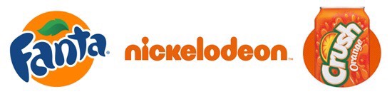
Orange
Nickelodeon’s bright orange logo stands out in a crowd, emphasizing its buoyant, lighthearted spirit. Fanta and Orange Crush have brilliant orange logos, and it perfectly captures the fun of grabbing a soda on a hot afternoon.
Green
John Deere and the Girl Scouts both use the color green, reminding people that they are deeply connected to the earth. Whole Foods
emblazons their text in a strong green, taking advantage of the fact
that people associate green with health and natural foods. TD Bank? Also green.
Black
Chanel’s logo is chic and tastefully understated, and instantly recognized in the fashion world. The dignified BBC
logo is similarly minimalistic, and their refined black styling gives
it a sense of authority and respectability worthy of a world class
broadcaster.
Sources:
Bowman, Amanda. “How 21 Brands Use Color to Influence Customers.” Crowdspring Blog, Crowdspring , 27 Mar. 2017, https://www.crowdspring.com/blog/how-21- brands-use-colors-to-influence-customers/.
Foundation, Interaction Design. “What Is Color Theory?” The Interaction Design Foundation, Interaction Design Foundation, 17 Mar. 2021, https://www.interaction-design.org/literature/topics/color-theory.
Decker, Kris. “The Bold, Bright Truth about Color Theory.” 99designs, 99designs, 7 July 2020, https://99designs.com/blog/tips/the-7-step-guide-to-understanding-color-theory/.
Editorial, OXP. “What Is Color Theory? - a Comprehensive Guide for Designers - Onextrapixel: What Is Color Theory, Color Theory, Color.” Pinterest, Pinterest, 14 Sept. 2020, https://in.pinterest.com/pin/what-is-color-theory-a-comprehensive-guide-for-designers-onextrapixel--193091902763030352/.
Cherry, Kendra. “Can Color Affect Your Mood and Behavior?” Verywell Mind, Verywell Mind, 28 May 2020, https://www.verywellmind.com/color-psychology-2795824.
Why Are Images Used In A Table Of Contents? Most cool magazine table of contents use photos as their medium of choice. This is because photos/images make a table of contents look unique, stylish and professional. Including photos in a table of contents, is part of mostly all mgazine conventions since, they are a great choice for tech, arts, and design titles. On-trend flat graphics are also used by magazine designers to create and make their table of contents look particularly design-forward. Professional magazine designers are known to use Adobe Illustrator, CorelDRAW, or Inkscape to create vector graphics, which make their table of contents look even more appealing and attention-grabbing. Vectors are a great way to express more abstract or fantastical concepts, and as a result are the perfect choice for magazine table of contents, as they make them more interesting to look at, as the abstract graphic catches the eye, and makes sure that the images, stand ...
My Final 2-page Spread Mockup This is my final mockup for the 2-page spread of my Art magazine. The section head of this 2-page spread is called, “Art Insider”, as the content present in the text, talks about the deeper meaning represented in the featured art pieces and gives a brief explanation behind their production. The section head is placed on the top of the 2-page spread, so that the reader can easily identify which category this article/spread is from. This gives the reader an opportunity to select which category is their favorite, and helps them locate their favorite article more efficiently and effectively. Section/Running heads are usually placed at the top of every page of a magazine and aid readers in navigating through an article easily. A running head should be designed creatively so that it looks good, because it is present on almost all pages of the magazine and a reader sees it every now and then. So, it has to be visually attractive.The Head...

:max_bytes(150000):strip_icc():format(webp)/the-color-psychology-of-black-2795814_FINAL-97d2606d4e7241438fce0314b65352ec.png)
:max_bytes(150000):strip_icc():format(webp)/color-psychology-white-2795822-c1ce7cb9ec874904a3b5a7a02f75cbb2.png)
:max_bytes(150000):strip_icc():format(webp)/the-color-psychology-of-red-2795821-7985a2837e83481c9512f3f71b20164d.jpg)
:max_bytes(150000):strip_icc():format(webp)/the-color-psychology-of-blue-2795815_v1-5c92a9ff46e0fb0001442792.png)
:max_bytes(150000):strip_icc():format(webp)/color-psychology-green-2795817_FINAL-9525be717fdc4872ac8f2b7a2ef4134c.png)
:max_bytes(150000):strip_icc():format(webp)/yellow-2795823-c99ac9bc583c4406a571527d2c4995be.jpg)
:max_bytes(150000):strip_icc():format(webp)/the-color-psychology-of-purple-2795820-77da5a7fa4de49999f374b8cad011d55.jpg)
:max_bytes(150000):strip_icc():format(webp)/the-color-psychology-of-brown-2795816-f9fb55a634b645139e71f2c38278181a.jpg)
:max_bytes(150000):strip_icc():format(webp)/the-color-psychology-of-orange-2795818-4d1edd20270b48e9afe800d509acbbde.jpg)
:max_bytes(150000):strip_icc():format(webp)/the-color-psychology-of-pink-2795819-68021fddca994270b71c0078fbcbd780.jpg)


Comments
Post a Comment