Conventions of Art Magazines
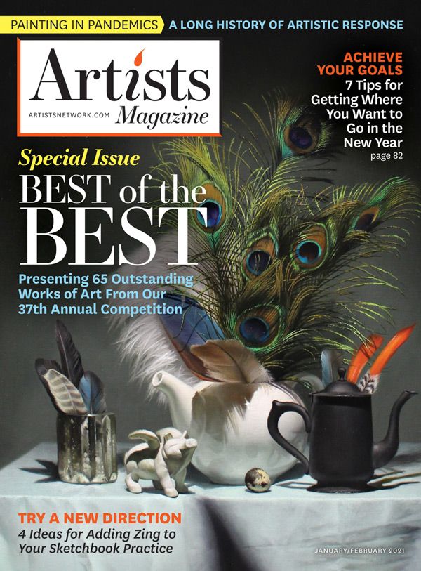
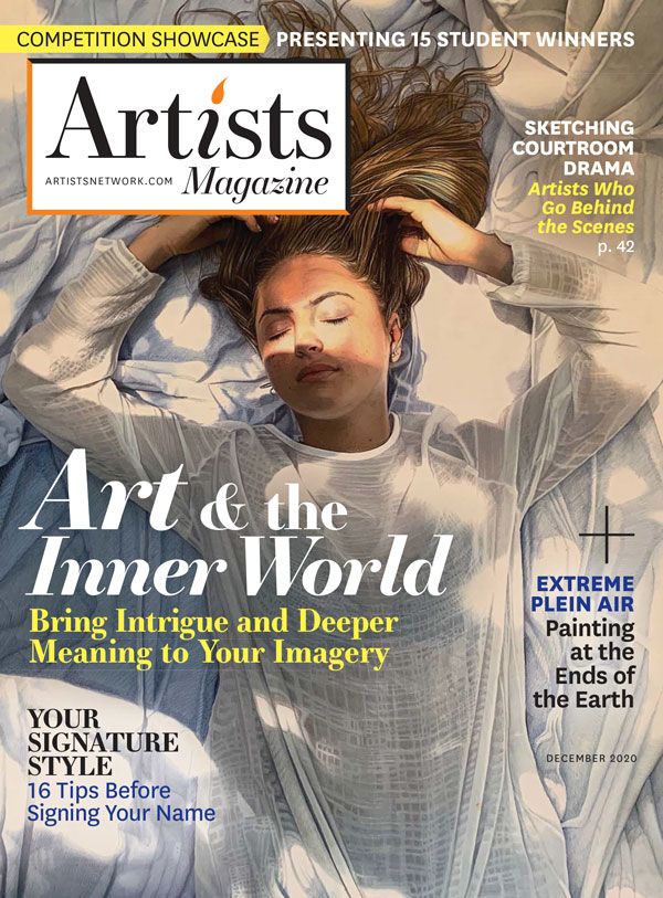
The cover of a magazine is the unified identity for a whole host of ideas, authors, and designers who have created the eclectic array of stories and articles and materials within each issue.

Magazine cover page serves several purposes. It sells the brand,
it has to be visually appealing and different from the other cover
pages on the newsstand to attract the new readers. On the other hand
each new cover must be different from the previous issue but still
familiar and recognizable to regular readers. It has to present the
publications character and its content. All of this make the cover page
the most important page in any magazine.
Magazine covers are a challenge to design, since they have to be both ever-changing and also consistently recognizable. For this reason, most publications stick to a standard set practices.
What is a Masthead?
The masthead is usually found in the front pages of a magazine or journal and it is essentially a one-page informational overview of a publication and everyone involved in its creation. The masthead lists editorial staff, publisher, subscription details, and contact information.

Members of the advisory board, readers, interns, proofreaders, and designers are also often listed. Some mastheads will include other information, such as granting institutions that help fund the publication or details on how to submit work. Some will even have a brief explanation of the publication’s title or a mission statement.
What is a Selling Line?
In increasingly competitive markets, selling lines have the power to shout above the racket and noise of the newsstand and sell copies. Selling lines reflect the brand personality of a magazine, directly appealing to the target reader.
Every art magazine has a main theme for the issue, and that makes the selling line on a cover. Desiners try to emphasize the selling line by using a slightly different font that goes with the theme. They also use different colors that complement the imagery and adjust the size to have more prominence on the cover. This creates a dynamic cover and drwa the reader’s eyes to the selling line element first.
What is a Main Image?
The main image of an art magazine can be a photograph or an illustration. That’s decided depending on the main story of the magazine and the art direction. Low-quality images can really ruin a magazine cover. Many magazines set up special photoshoots or commission illustrators to create a unique cover and use conceptual images. Crisp, clean, and detailed images will attract readers' attention and just scream quality.

One thing designers have in mind when
designing magazine covers is to use professional images. When companies invest in high-quality photos and have a cover image that stands out
among the others, they improve the chances of selling more. Also, keep in
mind that the image comapnies use draw the readers in and make them
curious to know everything the magazine contains. So investing in
photography is one of the most important aspects of a
magazine.
What are Cover Lines?
When it comes to the placement of the cover lines, art magazines aim for balance. Cover lines are set at a smaller point size compared to the lead article. Every art magazine has one, depending on the topic or the person being interviewed. The cover line topics can revolve around the main theme of the magazine, but not necessarily. Cover lines have no more than ten words and are concise. They use words specifically to draw the readers attention.
Usually the most important part of any cover is interaction between the words and picture. If done right, it will send the message and it will instantly be spotted in the sea of covers on a newsstand. Some magazines go for few cover lines, some fill almost each empty space with cover lines. Again, it all depends on the character of the publication.Writing cover lines is a role of copy editor or editor in chief. You may think this is an easy task, but to create appealing and attractive cover lines, it takes time and lots of effort.

A cover needs one line set in big type and it has to be the best cover line. It is a call for action, solution to problems, powerful statement or some word play. Some marketing research states that the average person spends 3-4 seconds on average glancing at the cover pages displayed on newsstands. This is why everything is clear instantly, from the design related concept of the cover to the words in cover lines.
What is Typography/Font?
Typography has an elusive non-destructive bond. It is through the unique typeface used for a masthead that people, in the first place, recognize their beloved printed matter on the shelf. Highlighting key topics on the cover is another common use of typography. As well as these two important tasks that are entrusted on the fragile shoulders of typography, it also plays a decorative role.
Usually it happens when striking illustrations are not enough to make the cover stand out, or when the artist wants to refer to the original purpose of the cover itself, namely, briefly interpreting all the information that is hidden inside the magazine. In this instance, a traditional approach of using sets of typefaces, various font properties, and spacing are spiced up with abstractions or illustrations, which do a great job in making a cover look both informative and ingenious.
What is a Bar Code?
Magazine barcodes and newspaper barcodes
are based on the ISSN number (International Standard Serial Number) of
the magazine or newspaper. This applies to all magazines, newspapers,
and other periodical publications. We can supply the barcode images
based on your ISSN number.
What is Inside An Art Magazine?
An Art magazine provides an example of how a print publication can engage with a community of readers and contributors. While online publishing allows for ambitious publications that cater to a small audience, the ability of the web to reach anyone, anywhere makes such small-scale operations seem futile or unambitious.
What are Headlines?
Headlines are the first and most important textual element on any magazine page. The headline is as important as the layout. After the reader opens the page first thing that catches their attention is the layout or some dominant image.

The second thing that will draw their attention and lure them into reading the article is the headline. The reader may find layout
attractive but if the headline is not appealing and interesting they may
skip that article and continue on.
Headlines can vary in size and the importance of the article determines headline size. The positioning of the headline is also vital, which is why magazine designers place their headlines on the top of a page.
This is the place where the eye will go first. Designers place headlines at the top, in order to give it the importance it deserves. Lastly, headlines are set in the bigger size regarding other text elements on the page.
What is an Intro/Kicker?
The Kicker acts as an introduction to the article. After headline catches the attention of the reader, the kicker acts as a bridge between headline and body copy. It sets the tone of the article and briefly describes what can the reader expect from the rest of the article. Intro/Kicker text summarize the story and attract reader’s attention.

From the design point of view, kickers are set in bigger type size than body copy but in a much smaller size than the headline. Designers can also make the kicker in a different type style. If a designer sets a headline in serif type, then they use sans-serif type for the kicker.
Magazine designers also place intro/kicker text just below the headline because they work as a team. Headlines draw the reader’s attention, gets them curious and the intro/kicker text solves their curiosity by giving them more information about the article. That’s why the headline and kicker work as a team and are to be kept together.
What is a Body Copy?
Body Copy is the largest part of any article. It is as interesting as the design, as the headline and intro text. No matter how good the design is, if the main body copy is not written in interesting ways, the magazine will lose readers, slowly but certainly.

Designing body copy is the first thing that designers do when designing the templates for the magazine. Setting right margins, columns and size of the body copy affect its readability and usability.
The size of the body copy is consistent throughout entire magazine. Headline size is also changed according to the importance of the article. Intro size can vary also, but the body copy stays the same.
What is a Drop Cap?
Drop caps are an effective way of grabbing readers attention because they add personality and visual strength to the page. Drop caps drop below the baseline can be used instead of paragraph subheads. Their origins date back to the 9th century when they were used in religious books. Those drop caps were richly illustrated, painted in bright colors and gilded.
|
|

What Are Pull Quotes?
Pull quotes are very useful and attractive design element. Magazine designers work with their copy editor to pull out the most interesting parts of the story and emphasize them. Pull quotes serve as a great tool to break up big blocks of body copy and to give a more interesting look to the article.
Designers use them in conjunction with the image so they together can tell a story in their own way. Pull out quotes can be taken out directly from the body text or they can be summarized excerpts but that will be copy editor’s decision.

Pull out quotes are set in a big enough size so that they pull the reader’s attention. The size of a pull quote is not nearly as big as headline’s. Designers emphasize pull quotes with frames, they put it in a circle or inside big exaggerated quote signs. Lastly, Pull quotes are also used to stretch across few columns or to break up the magazine's body copy.
What are Bylines?
In design, a byline is a short phrase that indicates the name of the author of an article in a publication. Used in newspapers, magazines, blogs, and other publications, the byline tells the reader who wrote the piece.

In addition to giving credit where credit is due, a byline adds a level of legitimacy to the article; if a piece has a byline from an experienced writer with a good reputation, it's a sign of credibility for the reader.
Bylines in art magazines usually appear after the headline or subhead of an article but before the dateline or body copy. It's almost always prefaced by the word "by" or some other wording that indicates that the piece of information is the name of the author.
What is White Space?
White space is the area between design elements. It is also the space within individual design elements, including the space between typography glyphs (readable characters). Despite its name, white space does not need to be white. It can be any color, texture, pattern, or even a background image.
White space is a great tool to balance design elements and better organize content to improve the visual communication experience. A technical writer in charge of composing hundreds of manuals for a kitchen appliance company, use white space to find a superb balance of words and images.

Few people read manuals for pleasure; it is then crucial to hold the readers’ attention! For that, the white space is the real star of the show, working between the words and the pictures. It keeps each page from looking busy.
Summary


Art magazine covers often use very bright and vivid colors on their cover pages. Their cover pages often use some kind of painting/drawing as the main image on their cover pages. We also see a variety of texts used for the masthead of these magazines.
The selling line is often in the same color as the masthead, but the size and font vary. There are many coverlines that are present on the magazine and they are often about different artists and articles about tips to improve your painting/drawing/art.
There are many varieties of typefaces and fonts used in an art magazine’s cover page. The most often used typefaces are Isidora Sans. Chronica Pro Family, Solitas Slab and Bebas Neue Pro. These typefaces are mainly used for their uniqueness and boldness. The most used fonts are Isidora Sans Italics, Chronica Pro Bold, Magnetico and NY Irvin.
Sources:
https://www.magazinedesigning.com/introduction-to-magazine-cover-pages/
99% invisible, Roman Mars. “Cover Story: The Fascinating Anatomy of a Magazine Cover.” Gizmodo, Gizmodo, 18 Feb. 2014, https://gizmodo.com/cover-story-the-fascinating-anatomy-of-a-magazine-cove-1524542884.
Reissenweber, Brandi. “What Is a Magazine's Masthead and Where Would I Find It?” Answers to Writing Questions - Publication - Gotham Writers Workshop, Ask The Writer, 21 Apr. 2022, https://www.writingclasses.com/toolbox/ask-writer/what-is-a-magazines-masthead-and-where-would-i-find-it?page=3.
Keung, Laura. “How to Make the Best Magazine Cover Design (& Learn The Anatomy of a Magazine Cover).” Design & Illustration Envato Tuts+, Envato Tuts, 26 June 2020, https://design.tutsplus.com/articles/how-to-make-the-best-magazine-cover-design-learn-the-anatomy-of-a-magazine-cover--cms-35126.
Genower, Peter. “Selling Lines.” InPublishing, InPublishing, 3 Jan. 2007, https://www.inpublishing.co.uk/articles/selling-lines-1981.
Dolores , Delia. “The 10 Golden Rules of Magazine Cover Design.” Flipsnack Blog, Flipsnack Blog, 24 Sept. 2021, https://blog.flipsnack.com/how-to-design-professional-magazine-covers/.
Birch, Nataly. “Magazine Covers with Amazing Typography.” Onextrapixel, Onextrapixel, 27 Aug. 2012, https://onextrapixel.com/magazine-covers-with-amazing-typography/.
Barcodes, Simply. “Barcodes for Beginners - A Guide.” Barcode for Magazine Covers & Periodical/Issue Supplemental Codes, Simply Barcodes, 21 Apr. 2022, https://www.simplybarcodes.com/barcode-magazines.html.
Barcodes, World. “Magazine Barcodes And Newspaper Barcodes.” World Barcodes, World Barcodes, 15 Mar. 2022, https://worldbarcodes.com/magazine-barcodes/.
Gat, Orit. “What Can an Art Magazine Be?” The White Review, The White Review, 4 Oct. 2017, https://www.thewhitereview.org/feature/what-can-an-art-magazine-be/.
https://www.magazinedesigning.com/drop-caps-and-initial-letters/
Bear, Jacci Howard. “What Is a Byline?” Lifewire, Lifewire, 24 July 2021, https://www.lifewire.com/what-is-an-article-byline-1078265.
Soegaard, Mads. “The Power of White Space.” The Interaction Design Foundation, The Interaction Design Foundation, 19 Apr. 2021, https://www.interaction-design.org/literature/article/the-power-of-white-space.


Comments
Post a Comment