Magazine Design and Layout Tips
What is magazine layout design?

A layout is an important part of graphic design and it is formed by the arrangement of elements in the design as per a brand's style and character. Magazine layout design refers to the process in which all vital elements such as headlines, running heads, body copies, bylines, images, and captions are aligned in a perfect manner. This creates a layout that will improve the reading experience for the audience.
Tips And tricks For Creating A Great Magazine Design/Layout
1. Wrap Text Around Images in Unusual Ways


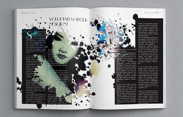
Aerial shots allow you to merge typography into the photo seamlessly—try filling those gaps with unusual headers and chunks of body text for an eclectic, creative style.
3. Create 3-D Effects

When designing, expand the Layers panel and create a series of layers in this order: Background of Photo, Text Behind, Subject of Photo, and, finally, Text in Front at the top of the pile. Splitting up your content in this way will help you achieve the your desired 3-D look.
4. Make The Table Of Contents More Aesthetic and Colorful

After all, nobody wants to read a long, dull list—introduce images, color, interesting typography and an unusual grid to give your contents page some life. You won’t regret spending the time perfecting this all-important spread.
5. Make Your Spread Pop!


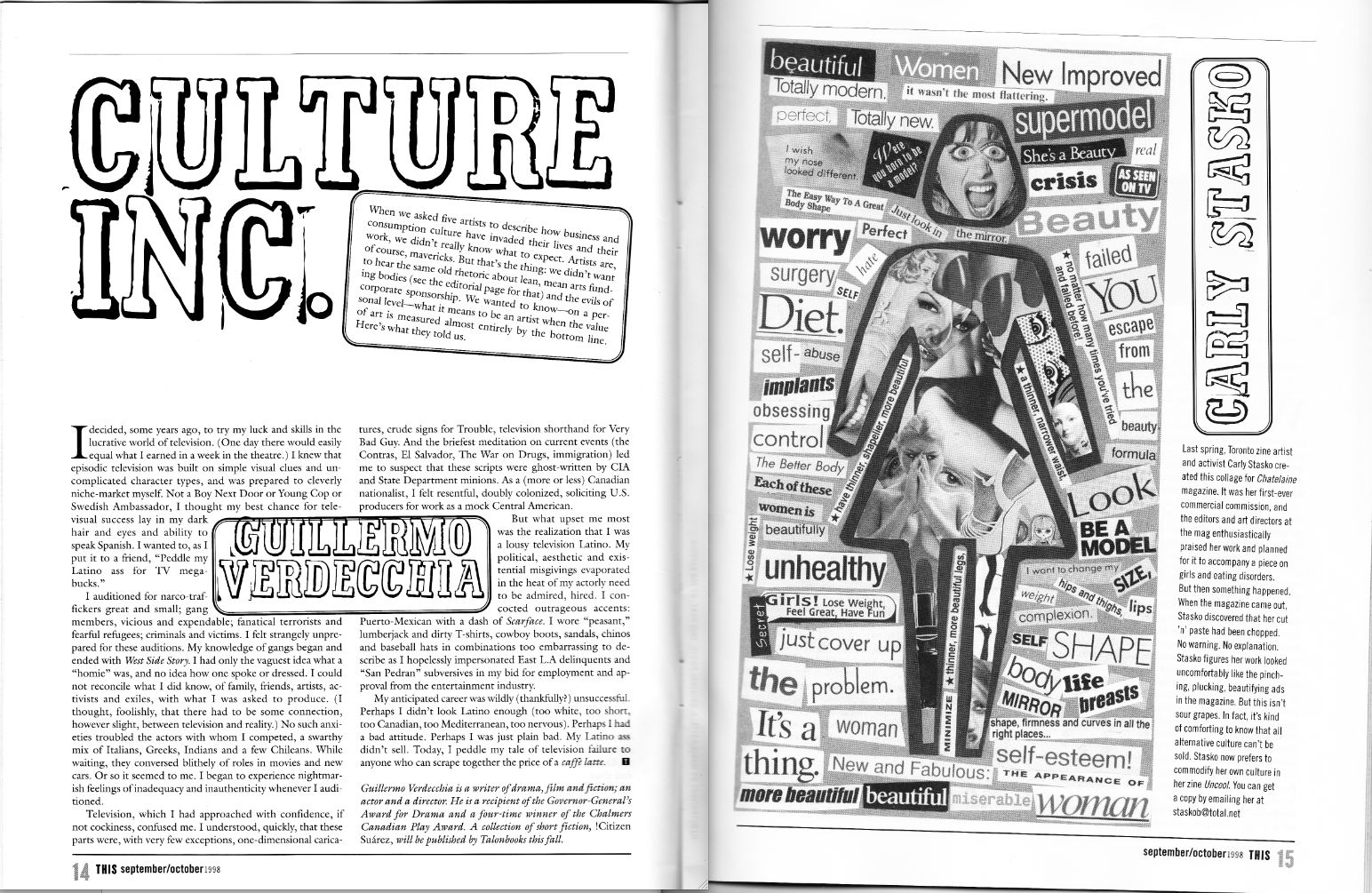
Most pages of your magazine either feature images, blocks of text, or both. A page or even double page spread that breaks up this pattern by using an infographic is going to immediately catch the reader’s eye and therefore their attention.
Infographics are a great way of imparting complex information for what would otherwise be a very text-intensive article as they make ideas easier to absorb and remember.
7. Focus on Fonts

Combining a stylish serif font for your headlines, with a modern sans-serif for the body text can have a really powerful impact.The most important thing to keep in mind is that the font of your body text needs to be easy to read.
8. Grab The Reader's Attention With Pull Quotes

Pull quotes can be used to give a flavor of what is coming in the articles. A pull quote is a quote taken directly from the article that is presented in a much larger font than the body text.
It can even be given its own page if the impact of such a statement is worthy of the content. By choosing pull quotes that will really peak the interest of the reader you can immerse them into articles, they might not otherwise read. The design of your pull quotes can have a strong impact, so it’s definitely worth putting some effort into these.
9. Use White Space

Whilst content is obviously the most important thing on the page, it needs room to breathe. Try to keep away from the desire to fill every page from top to bottom. Leaving white space not only makes your design look stylish but helps to draw the eye to the content you want your readers to be focusing on. Too much going on can be quite off putting.
10. Be Consistent

11. Harness Contrast

12. Pay Attention To Details

The deeper your knowledge of great editorial design, the quicker you can call on inspiration when trying out ideas – or know which clichés or tropes to avoid. Spend time with the content , in order to be able to put together the work more intuitively.
13. Design For The Reader

Adapting your style and producing legible and accessible work is vital to engaging your audience; the same goes for decisions around paper stock, page size and count, and so on. Every design decision should be made intentionally with the end user in mind.
14. Strike A Balance


How Do Art Magazines Use These Magazine Tips?
Art magazines use wrapping text around images in unusual ways, in order to create layouts that are less grid-like, unified and more free-flowing. Art magazines also use many aerial shots as this allows it to merge typography into the photo seamlessly. This is achieved by filling gaps with unusual headers and chunks of body text, in order to create a more eclectic style.

Art magazines also create multiple layers of text and images to build up a 3-D look on their 2-D layouts. This is not only aesthetically appealing, but also catches the attention of the reader and helps them engage with the magazine.

Art magazines are well-known to introduce images, color, interesting typography and unusual grids to their table of contents in order to give them a personality of their own. Art magazines also use big bold typorgraphy for their opening spreads as this creates a great flow with dramatic photography.

Art magazines use rounded sans serif a lot, in order to make their layouts fun, childlike and bursting with energy. Designers also theme their typography around the subject of the article. This makes the text look loud and ensures that the reader is engaged with the magazine.

Art magazines also create many inforgraphics, in order to give their content some punch. Designers use these inforgraphics as a means to simplify complex information for what would otherwise be a very text-intensive article. Art magazines use these inforgraphics in order to help the reader absorb and remember the ideas in an easier and efficient way.

Art magazines also focus a lot on their fonts, as choosing the correct fonts reflect the quality of the magazine's layout designs. Art magazines are well-known for combining a
stylish serif font for their headlines, with a modern sans-serif for their
body text. Designers use this technique, in order to have a really powerful impact
on the reader, while making the body text easier to read.
Art magazines also use pull quotes in order to give the reader a flavor of what's coming in the articles. These pull quotes are usually said by the artist, whose painting/art is being featured in the article. Art magazines use pull quotes in order to peak the interest of the reader, which helps them immerse into the articles.

Sources:
PGBS, PGBS. “Magazine Layout Design Helpful Tips & Guide with Examples.” PGBS, PGBS, 14 Apr. 2022, https://www.proglobalbusinesssolutions.com/magazine-layout-design/.
Morris, Sam. “5 Pro Tricks to Instantly Improve Your Magazine Layouts.” InDesignSkills, InDesignSkills, 12 Oct. 2021, https://www.indesignskills.com/inspiration/magazine-layout-design/.
Kanti, Andina. “Magazine Design: 9 Incredible Tips You Can Try Now.” MagLoft, MagLoft, 5 May 2021, https://www.magloft.com/blog/incredible-magazine-design-tips/.
Tonge, Luke. “14 Best-Practice Rules for Striking Editorial Design.” Creative Bloq, Creative Bloq, 25 Sept. 2018, https://www.creativebloq.com/advice/editorial-design-tips.
India, Outsource to. “5 Useful Tips for Magazine Design Layout - outsource2india.” Outsource to India, Outsource to India, 21 Apr. 2022, https://www.outsource2india.com/creative-services/articles/magazine-design-layout-tips.asp.


Comments
Post a Comment