A font is a set of printable or displayable textcharacters in a specific style and size. The type design for a set of fonts is the typeface and variations of this design form the typeface family . Thus, Helvetica is a typeface family, Helvetica italic is a typeface, and Helvetica italic 10-point is a font. In practice, font and typeface are often used without much precision and are often interchanged.
What is the Psycology of Fonts?
Human beings respond to visual culture in an emotional way, designers can manipulate the psychological responses of their viewers by making informed choices about the features of a design, such as colors and fonts. Applying the psychology of fonts in marketing is starting to become an important field of research and practice in branding and advertising.
The Picture Superiority Effect, states that the appearance of the text (i.e. the font) on a brand’s logo, advertising and other output is more important in determining brand perception and brand memorability than the written content.
Not only is the appearance of text an important consideration for brands, but the appearance of different fonts can also have psychological effects on the viewer. By changing the style of font, choosing a more emotional font or a powerful font, a designer can make the viewer feel and respond differently towards a brand.
For example, a bank that wants to communicate a sense of stability and heritage to its customers might opt for a traditional serif font, while a tech start-up might choose a futuristic sans serif font, to encourage customers to perceive them as innovative and forward-thinking.
What emotions do certain fonts evoke?
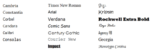
Wichita State University’s Software Usability Research Laboratory conducted a surveyin 2006 to determine if different fonts had different emotions and personalities associated with them.
In the survey, they asked more than 500 participants about their perceptions of a variety of different fonts across the typefaces outlined above. The fonts that respondents answered questions about were:
Different uses of each font were evaluated in the survey, such as emails, letters, spreadsheets, web pages, headlines, and news articles.
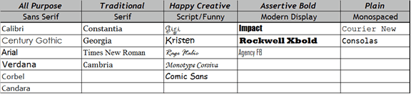
Respondents were then asked to assign personalities and emotions to each font, and the results were organized according to personality factors that the different fonts shared most frequently. The fonts within specific typefaces ended up grouping together, as you can see in the diagram below:
The study then produced a detailed breakdown of the fonts most commonly associatewith both positive and negative emotions and personality traits. The results are intriguing:
Serif fonts were rated as “stable,” “practical,” and “mature.”
Sans serif fonts didn’t receive any particularly positive or negative personality associations.
Script fonts were perceived as “feminine,” “funny,” and “casual.”
Modern fonts were categorized as “masculine,” “assertive,” and “coarse.”
Mono spaced fonts were called “dull,” “plain,” and “unimaginative.”
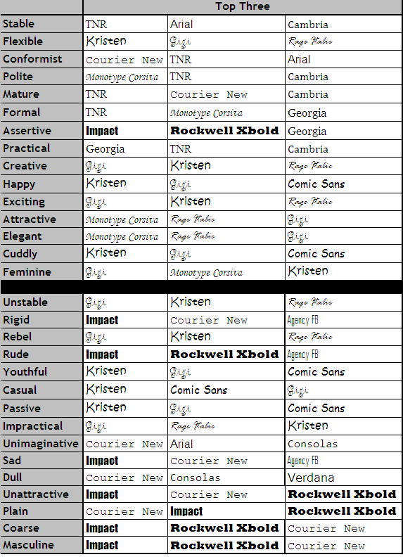
Here’s the full breakdown of the top three fonts for each emotion and personality trait in the survey:
The 6 Main Types Of Font Styles
Just as people have certain feelings and associations that they link to specific colours, the same can be said when it comes to font psychology. We automatically react differently to the way that text is written. In other words, it’s not just what you say, but how you say it.
For instance, if you’re interested in conveying the idea that your business is respectable or traditional, then you’d choose a font style that’s rooted in ideas of heritage. On the other hand, if you want people to see your business as stable and welcoming, then you might choose a less formal, sans-serif typeface.
Let’s look at typography in logo design, and how each font can communicate different things.
1. Serif font psychology
Starting with the most traditional font option, serif fonts promote feelings of class and heritage, making them ideal when you want to create a company that feels “established”. Due to their classical nature, serif fonts carry feelings of trust and respectability, making them perfect for brand identities that revolve around authority and grandeur.
Serif fonts work best in “formal” situations. They’re perfect for companies who want to build brand awareness, while demonstrating their trustworthy nature. Often, serif types are ideal for financial companies, academics, broadsheets, and editorials. Some of the most popular options are:
Times New Roman
Georgia
Garamond
2. Slab serif font psychology
Often regarded a “sub-set” of serif fonts, slab serif typefaces look like serifs, but have specific slab sections in them. They’re associated most frequently with confidence, solidity, and a sense of bold attitude.
Generally, slab serif fonts are best used by companies who want to make an impact on the market, either with an innovative new idea, or an intuitive product. They’re frequently used by car and technology brands who want to install confidence in their customers, while showing off some modern creativity. Favoured options include:
Courier
Rockwell
Museo
3. Sans serif font psychology
Sans serif fonts are clean, modern, and engaging. They’re used by brands who want to demonstrate a straight-forward, simple, and no-nonsense attitude. When it comes to typography in logo design, sans serif solutions indicate a sense of honesty and sensibility. There are no decorative elements distracting the eye or clouding the message.
The simple, yet effective nature of sans serif fonts make them perfect for brands who want to put clarity first when designing their company logo. Often, you’ll find these typefaces on clothing brands, technology companies, and businesses that are focused on “forward-thinking” ideals and brand purposes. A few of the best sans-serif fonts are:
Arial
Century Gothic
Helvetica
4. Script font psychology
Script fonts are generally a lot fancier than their serif counterparts. They’re intended to provoke ideas of femininity, elegance, and creativity, thanks to their hand-written nature. If you want to make your company feel more personal, and improve your chances of earning that all-important customer affinity, then script typefaces could be the perfect option. However, it’s important to make sure that the script you choose is legible.
When it comes to typography psychology, script fonts are probably the ones most likely to inspire emotional and creative ideas. They’re perfect for when you want to convey feeling, history, or experience, and can be particularly useful for “visual” brands who want to show off their creative side. The key is to use script fonts with caution. While they look artful and fancy, they can also be difficult to read in certain contexts. A couple of options to try might be:
Lucida Script
Lobster
Zapfino
5. Modern font psychology
“Modern” typography sounds like it should be the most futuristic of the bunch. However, the truth is that it’s been around since the eighteenth century. Designed to be simple and legible, modern fonts come with thin and thick transitions in the strokes between letters, and they can also have thin horizontal serifs.
When using typography in design for logos, modern fonts are used to convey feelings of exclusivity, intelligence, and style. If you’re hoping to showcase your brand name in a way that’s easy to read, and brimming with modern flare, then this font type could be just right for your brand. It’s fantastic at attracting the attention of millennials, thanks in part to its association with Facebook. Here are some modern fonts to explore:
Matchbook
Politica
Klavika
6. Display and decorative fonts
Finally, if you’re looking for typography logo design inspiration, you can’t get more creative than display or decorative fonts. These are unique, and sometimes customised typefaces that are far removed from the norm, and used most frequently in logos. Highly unique and stylised, these fonts add personality to your business, but it’s important to consider the emotional response your audience will have to them carefully before you commit to a specific choice.
Decorative or display fonts can be ideal for almost any business logo, because you can easily convey whatever personality is right for you. By tweaking, twisting, and fine-tuning your fonts, you can demonstrate your business as being casual, direct, fun, or unique. Some of the most common display fonts include:
Bombing
Gigi
Jokerman
However, decorative fonts can easily be designed from scratch, meaning that you can produce your very own custom typeface.
How do companies use fonts to their advantage?
The primary benefit that companies see in custom fonts, though, is their ability to imbue a brand with meanings that can reinforce those of the words their letterforms are spelling out. Typography expert Beatrice Warde’s 1932 notion that typography should function like an unobtrusive “crystal goblet,” allowing the reader to fully experience the wine — the text — it contains, rather than calling attention to itself as the container, went out the window long ago.
Typeface flexing does seem to be the best way to characterize the recent cascade of companies — Netflix, Airbnb, SAP — announcing their newly acquired typefaces, often with an accompanying website that proudly elaborates the finer details of the letterforms’ apertures, ascenders, and counters. It’s a process of one-upmanship that recalls the scene in American Psycho in which a group of Wall Street bros try to outdo one another with the “raised lettering,” “subtle off-white coloring,” and “tasteful thickness” of their business cards.
Companies’ introductions of their bespoke typefaces often inform us of the meanings they expect the fonts to communicate. We are told that Airbnb’s Cereal face “doesn’t take itself too seriously,” while SamsungOne is “solid, reassuring, and legible,” and YouTube Sans is not only full of “quirks and personality” but also “imperfect, unpredictable, and strong yet rough around the edges.” At times, the demands placed on these typefaces by their descriptions seem impossible to fulfill: Software company Atlassian’s Charlie Sans, for instance, is said to be “quirky and expressive when it needs to be, or neutral when the situation calls for something a bit more serious.”
There are some instances of variation, though. The cyborg-like letterforms of Plex, attempting to embody the concept of IBM as “a medium between mankind and machine,” are nothing if not distinctive. McKinsey & Company, fittingly for one of the few non-tech enterprises on this list, unveiled a rare serif typeface that is touted as “intentionally characterful” but comes across as haughty, in much the same way that Virginia’s serif-adorned license platesseem to say, “Our state is better than yours.” Maybe a firm implicated inpushing opioidsandpropping up authoritarian regimesshould have opted for the low profile of an intentionally characterless font, just as Philip Morris deflected bad PR by changing its name to Altria and adopting ananonymous pixelated bluras a logo. Arial probably would have sufficed.
The similarities among so many of these typefaces suggest that the public, which is apt toconfuse a square Google icon for a triangular Google icon, will have little chance of telling them apart. It may be that these fonts can better communicate to an internal audience. Their use could serve as a sort of secret handshake by which these companies’ employees might recognize their shared group membership, in the same way that Freemasons would stand with their feet at right angles to discreetly advertise their status to their fellows.
Sources:
Bowie, James I. “How Custom Fonts Became the Ultimate Corporate Flex.” Medium, Marker, 10 Dec. 2020, https://marker.medium.com/how-custom-fonts-became-a-corporate-flex-ab620fcfb34e.
Hanna, Katie Terrell. “What Is a Font?” WhatIs.com, TechTarget, 20 Apr. 2022, https://whatis.techtarget.com/definition/font.
Fussell, Grace. “The Psychology of Fonts (Fonts That Evoke Emotion).” Design & Illustration Envato Tuts+, Envato Tuts, 16 May 2020, https://design.tutsplus.com/articles/the-psychology-of-fonts--cms-34943.
Merritt, Kristena. “Emotional Typography.” What's a Word without a Shank?, Word Press, 14 Dec. 2017, https://wordshank.wordpress.com/articles-essays/research-papers/emotional-typography/.
Brands, Fabrik. “Font Psychology and Typography Inspiration in Logo Design.” Fabrik Brands, Fabrik, 16 Mar. 2022, https://fabrikbrands.com/font-psychology-and-typography-inspiration-in-logo-design/.
What is Color Theory? Color theory is the collection of rules and guidelines which designers use to communicate with users through appealing color schemes in visual interfaces. To pick the best colors every time, designers use a color wheel and refer to extensive collected knowledge about human optical ability, psychology, culture and more. Understanding Color Color is perception. Our eyes see something (the sky, for example), and data sent from our eyes to our brains tells us it’s a certain color (blue). Objects reflect light in different combinations of wavelengths. Our brains pick up on those wavelength combinations and translate them into the phenomenon we call color. When you’re strolling down the soft drink aisle scanning the shelves filled with 82 million cans and bottles and trying to find your six-pack of Coke, what do you look for? The scripted logo or that familiar red can? People decide whether or not they like a product in 90 seconds or less. 90% of that...
Why Are Images Used In A Table Of Contents? Most cool magazine table of contents use photos as their medium of choice. This is because photos/images make a table of contents look unique, stylish and professional. Including photos in a table of contents, is part of mostly all mgazine conventions since, they are a great choice for tech, arts, and design titles. On-trend flat graphics are also used by magazine designers to create and make their table of contents look particularly design-forward. Professional magazine designers are known to use Adobe Illustrator, CorelDRAW, or Inkscape to create vector graphics, which make their table of contents look even more appealing and attention-grabbing. Vectors are a great way to express more abstract or fantastical concepts, and as a result are the perfect choice for magazine table of contents, as they make them more interesting to look at, as the abstract graphic catches the eye, and makes sure that the images, stand ...
My Final 2-page Spread Mockup This is my final mockup for the 2-page spread of my Art magazine. The section head of this 2-page spread is called, “Art Insider”, as the content present in the text, talks about the deeper meaning represented in the featured art pieces and gives a brief explanation behind their production. The section head is placed on the top of the 2-page spread, so that the reader can easily identify which category this article/spread is from. This gives the reader an opportunity to select which category is their favorite, and helps them locate their favorite article more efficiently and effectively. Section/Running heads are usually placed at the top of every page of a magazine and aid readers in navigating through an article easily. A running head should be designed creatively so that it looks good, because it is present on almost all pages of the magazine and a reader sees it every now and then. So, it has to be visually attractive.The Head...


Comments
Post a Comment