In this blog, I am going to be talking about the magazine TOC mockups I made for my art magazine. I have made 3 TOC mockups in total, and each are different form each other, in terms of design. The first section of this blog is going to be about, how these 3 TOC mockups connect to my magazine genre, which is Art. I will dissect these mockups piece by piece, and explain in detail, the reasoning behind my choices. This reasoning will be supported by concrete evidence, which will be taken from previous blogs. Laslty, for the second section, I will be explaining my creation process behind these 3 TOC mockups. The process will be supported by actual images and will be explained in detail. The process will give my audience an accurate represenation of what worked and did not work, while creating these TOC mockups.
My First TOC Mockup


This is the first mockup I made. This mockup incorporates many colorful elements, such as the multicolored triangles in the corner and the vines, which represent the borders of the page. These elements not only make the TOC attention-grabbing, visually appealing and professional, but also give it an artistic style and personality. Keep in mind, this TOC is a 2-page spread, as it follows the conventions of an Art magazine. 2-page spread TOC's are very common in Art magazines, as they prevent the reader form getting bomabarded by information, while maintaining and professional and informational appearance. This design is both informational and visually appealing as the article titles that are included in the TOC can easily be seen by the reader. This gives the reader, the required information, in order to make a decision, on which article they are most interested in, and where can they find that article. By bolding out the page numbers of the article, I am not only making these page numbers look more defined and clear, but also giving them more power, so that the reader can easilty figure out, which page number is their chosen article on. The boldness also adds to the visual appeal of the TOC and makes it look more professional. The font I used for this TOC is Open Sans, as it is a Sans serif font, which are used in many Art magazines, because of the power and definition they give to the text. By changing my text into a sans serif font, I am not only giving it more power and defintion, but also increasing the impact of the text on the reader. A sans serif font can really imapct the reader mind, when they are scrolling through the magazine, as they first catch the reader's attention, and then imapact them, with the emotions of power and defintion. This gives the reader an opportunity to connect with the magazine and the contents present in it. The images I used for this magazine convey various emotions of power, sadness, fear, tranquility, calmness, excitedness and most importantly, happiness and positvity. When formatting images, I chose to place them on the brighter and more vivid side of the spectrum, as this aligns with the conventions of my genre. Most Art magazine TOC's, have very bright and vivd imagery, in order to keep the reader interested in the magazine, and encourage them look over anf go through the table of contents. The brightness used in a most of my images is probably like a 10/100, which not only makes the image bright, but also makes it more clean and clear to the eyes. Keep in mind, increasing the brightness of an image is not always the right thing, as if you increase the brightness too much, then the image will become much harder to see, and will also cause a lot of stress on the eyes. I also increased the saturation of my images, as the saturation makes the image more vivd and colorful, giving the images more defintion and power. The saturation for these images is probably around 35/100. Keep in mind, that increasing the saturation of an image is not always a good thing, as the saturation is too much, then the art starts to look fake. Increased saturation can also lead to, too much color, which can stress the reader eyes, making it harder to see the original image. So, in order to prevent this from happening, I also increased the contrast of the image, in order to balance out the brightness and saturation. The contrast for these images is probably a 65/100. The contrast not only gives the images a beautiful and appealing effect, but also makes it attention-grabbing and easy on the eyes, as it increases the amount of clashing between the colors, which prevents them from blending and gives them more definition and style.
Process Behind My First TOC Mockup
This
is the first part of my process, when making a table of contents. In
this part, I chose the images, I wanted to include in my first page of
my table of contents, since it is going to be a 2-page spread. The
images that I chose, were took by me, and the reasons why I chose these
images, is because they represent various emotions, and are very clean,
appealing, attention-grabbing, and professional. They also have an
artistic personality to them, which aligns with the conventions of an
Art magazine.

This
is the part, where I started formatting my images. I did this, in order
to make them look clean, appealing, attention grabbing and
professional. I was able to achieve this by changing the brightness,
contrast and saturation for each image. I also cropped these images, so
that they could properly fit the page. Contrast and saturation are two very important elements, in relation to
photos. This is because, contrast manages the amount of
difference there is between the colors of the image, as if the colors
are clashing together, then the image becomes painful to see, which is a
very bad sign. The saturation is what makes the colors bright or dark.
Saturation and Contrast go hand in hand, as if the saturation is too
much, then the contrast has to be enough to balance it out and vice versa.
The balance in this image results in it being very beautiful and visually appealing, which
is good for catching the audience's eyes and peaking their interest in
the magazine.

This
is the part where I started positioning my images. By positioning them
like this, the reader will easily be able to see, which article is
featuring which piece/photo of art. I positioned these image, in a bow
and arrow style, as all of my images are left aligned. I chose this
style so that the article titles can be easily seen through out the
page. Also, the bow and arrow style, gives the table of contents a
creative touch, which is needed in order to make it look more appealing
and professional.
This
is the part, where I started adding text boxes to my first page of my
table of contents. By adding text to my table of contents, I am making
it more balanced and informative. As, a table of contents with just
images, isn't informative and is practically of no use. Also, an image
with only text, isn't good either, as it bombards the reader with what
would seem like unncessary information and makes the table of contents
less appealing and attention-grabbing.

This
is the final part of my process, for my first page of my 2-page spread
table of contents. This is where, I added creative elements to the page,
in order to make it more appealing and professional. By adding these elements, I'm not only making the table of contents look good, but also
encouraging the reader to actually look at the contents and focus on it,
as it was one of the most essential elements of a magazine. I also
added some final touches to the page, by inserting bright blue triangles
in the corner, and adding vines to the sides, in order to depict a
border. This was also the part, where I reviewed my process, as it is very common for designers to revise their table of contents and look at it
from a reader’s perspective, so that they know whether the table of contents is
going to benefit or harm the magazine’s sales. This is a very important
method, as it gives the designer the opportunity to revaluate their
magazine table of contents, to make sure that it aligns with most of the conventions
of their selected genre, correct their mistakes, if any, so that the
final table of contents looks professional, appealing, and attention grabbing, in
order to ensure that the magazine is interesting from the inside.

This
is the first part of my process, when making a table of contents. In
this part, I chose the images, I wanted to include in my second page of
my table of contents, since it is going to be a 2-page spread. The
images that I chose, were took by me, and the reasons why I chose these
images, is because they represent various emotions, and are very clean,
appealing, attention-grabbing, and professional. They also have an
artistic personality to them, which aligns with the conventions of an
Art magazine.

This
is the part, where I started formatting my images. I did this, in order
to make them look clean, appealing, attention grabbing and
professional. I was able to achieve this by changing the brightness,
contrast and saturation for each image. I also cropped these images, so
that they could properly fit the page. Contrast and saturation are two very important elements, in relation to
photos. This is because, contrast manages the amount of
difference there is between the colors of the image, as if the colors
are clashing together, then the image becomes painful to see, which is a
very bad sign. The saturation is what makes the colors bright or dark.
Saturation and Contrast go hand in hand, as if the saturation is too
much, then the contrast has to be enough to balance it out and vice versa.
The balance in this image results in it being very beautiful and visually appealing, which
is good for catching the audience's eyes and peaking their interest in
the magazine.

This
is the part where I started positioning my images. By positioning them
like this, the reader will easily be able to see, which article is
featuring which piece/photo of art. I positioned these image, in a bow
and arrow style, as all of my images are right aligned, so when
combining the 2 pages together, the text present in the table of
contents will create the beautiful opposing effect between the text.
making it look creative and appealing. I chose this
style so that the article titles can be easily seen through out the
page. Also, the bow and arrow style, gives the table of contents a
creative touch, which is needed in order to make it look more appealing
and professional.

This
is the part, where I started adding text boxes to my second page of my table of contents.
By adding text to my table of contents, I am making it more balanced
and informative. As, a table of contents with just images, isn't
informative and is practically of no use. Also, an image with only text,
isn't good either, as it bombards the reader with what would seem like
unncessary information and makes the table of contents less appealing and attention-grabbing.

This
is the final part of my process, for my second page of my 2-page spread
table of contents. This is where, I added creative elements to the page,
in order to make it more appealing and professional. By adding these elements, I'm not only making the table of contents look good, but also
encouraging the reader to actually look at the contents and focus on it,
as it was one of the most essential elements of a magazine. I also
added some final touches to the page, by inserting bright blue triangles
in the corner, and adding vines to the sides, in order to depict a
border. This was also the part, where I reviewed my process, as it is very common for designers to revise their table of contents and look at it
from a reader’s perspective, so that they know whether the table of contents is
going to benefit or harm the magazine’s sales. This is a very important
method, as it gives the designer the opportunity to revaluate their
magazine table of contents, to make sure that it aligns with most of the conventions
of their selected genre, correct their mistakes, if any, so that the
final table of contents looks professional, appealing, and attention grabbing, in
order to ensure that the magazine is interesting from the inside.
My Second TOC Mockup

This is the second mockup I made. This mockup incorporates some of the colorful
elements, such as the bronze columns that are separating the different types of article, in order to make the look more oragnized. These elements not only
make the TOC attention-grabbing, visually appealing and professional,
but also give it an artistic style and personality. Keep in mind, this
TOC is a 1-page spread, as it subverts the coneventions of an Art magazine. 1-page TOC's are very rare in Art magazines, as most of the times, the reader gets bomabrded by unnecessary information because all of the article titles are fit in 1 page. Eventhough, 1-page TOC subverts my genre's conventions, I included it, as my magazine does not have that many article titles, allowing me to explore a wider range of designs and formats. I did have to make my images smaller, in order to fit 1-page, but this makes them look more organised and defined, giving the reader an opportunity to look connect the article title they are searching for, with the preview of the art that is going to be featured in the magazine. This design is both
informational and visually appealing as the article titles that are
included in the TOC can easily be seen by the reader. This gives the
reader, the required information, in order to make a decision, on which
article they are most interested in, and where can they find that
article. By bolding out the page numbers of the article, I am not only
making these page numbers look more defined and clear, but also giving
them more power, so that the reader can easilty figure out, which page
number is their chosen article on. The boldness also adds to the visual
appeal of the TOC and makes it look more professional. The font I used
for this TOC is Open Sans, as it is a Sans serif font, which are used in
many Art magazines, because of the power and definition they give to
the text. By changing my text into a sans serif font, I am not only
giving it more power and defintion, but also increasing the impact of
the text on the reader. A sans serif font can really imapct the reader
mind, when they are scrolling through the magazine, as they first catch
the reader's attention, and then imapact them, with the emotions of
power and defintion. This gives the reader an opportunity to connect
with the magazine and the contents present in it. I also made some article titles larger than other, as this gives this gives the reader an incentive, to look at the article itself, as these larger article titles do not give a preview of the image they are going to feature, creating a sense of suspense and inquisitveness in the reader's mind. Laslty, I gave the article tiles a more paragraph-like structure, in order to give the more defintion and power. This paragraph structure also makes the article titles easier to read, as words are use less space and seem more concise. The images I used for
this magazine convey various emotions of power, sadness, fear,
tranquility, calmness, excitedness and most importantly, happiness and
positvity. When formatting images, I chose to place them on the brighter
and more vivid side of the spectrum, as this aligns with the
conventions of my genre. Most Art magazine TOC's, have very bright and
vivd imagery, in order to keep the reader interested in the magazine,
and encourage them look over anf go through the table of contents. The
brightness used in a most of my images is probably like a 10/100, which
not only makes the image bright, but also makes it more clean and clear
to the eyes. Keep in mind, increasing the brightness of an image is not
always the right thing, as if you increase the brightness too much, then
the image will become much harder to see, and will also cause a lot of
stress on the eyes. I also increased the saturation of my images, as the
saturation makes the image more vivd and colorful, giving the images
more defintion and power. The saturation for these images is probably
around 35/100. Keep in mind, that increasing the saturation of an image
is not always a good thing, as the saturation is too much, then the art
starts to look fake. Increased saturation can also lead to, too much
color, which can stress the reader eyes, making it harder to see the
original image. So, in order to prevent this from happening, I also
increased the contrast of the image, in order to balance out the
brightness and saturation. The contrast for these images is probably a
65/100. The contrast not only gives the images a beautiful and appealing
effect, but also makes it attention-grabbing and easy on the eyes, as
it increases the amount of clashing between the colors, which prevents
them from blending and gives them more definition and style.
Process Behind My Second TOC Mockup
This
is the first part of my process, when making the second table of contents. In
this part, I chose the images, I wanted to include in my first page of
my table of contents. This TOC is going to be 1-paged. The
images that I chose, were took by me, and the reasons why I chose these
images, is because they represent various emotions, and are very clean,
appealing, attention-grabbing, and professional. They also have an
artistic personality to them, which aligns with the conventions of an
Art magazine.

This
is the part, where I started formatting my images. I did this, in order
to make them look clean, appealing, attention grabbing and
professional. I was able to achieve this by changing the brightness,
contrast and saturation for each image. I also cropped these images, so
that they could properly fit the page. Contrast and saturation are two very important elements, in relation to
photos. This is because, contrast manages the amount of
difference there is between the colors of the image, as if the colors
are clashing together, then the image becomes painful to see, which is a
very bad sign. The saturation is what makes the colors bright or dark.
Saturation and Contrast go hand in hand, as if the saturation is too
much, then the contrast has to be enough to balance it out and vice versa.
The balance in this image results in it being very beautiful and visually appealing, which
is good for catching the audience's eyes and peaking their interest in
the magazine.

This
is the part where I started positioning my images. By positioning them
like this, the reader will easily be able to see, which article is
featuring which piece/photo of art. I positioned these image, in an organized column style, as most of my images are center aligned. I chose this
style so that the article titles can be easily seen through out the
page. Also, the organized column style, gives the table of contents a professional touch, which is needed in order to make it look more appealing, in order to peak the interest of the reader.

This
is the part, where I started adding text boxes to my first page of my
table of contents. By adding text to my table of contents, I am making
it more balanced and informative. As, a table of contents with just
images, isn't informative and is practically of no use. Also, an image
with only text, isn't good either, as it bombards the reader with what
would seem like unncessary information and makes the table of contents
less appealing and attention-grabbing.

This
is the final part of my process, This is where, I added creative elements to the page,
in order to make it more appealing and professional. By adding these elements, I'm not only making the table of contents look good, but also
encouraging the reader to actually look at the contents and focus on it,
as it was one of the most essential elements of a magazine. I also
added some final touches to the page, by inserting bright, bronze lines in order to depict a column, which is repsonsible for making the TOC look organized and professional. This was also the part, where I reviewed my process, as it is very common for designers to revise their table of contents and look at it
from a reader’s perspective, so that they know whether the table of contents is
going to benefit or harm the magazine’s sales. This is a very important
method, as it gives the designer the opportunity to revaluate their
magazine table of contents, to make sure that it aligns with most of the conventions
of their selected genre, correct their mistakes, if any, so that the
final table of contents looks professional, appealing, and attention grabbing, in
order to ensure that the magazine is interesting from the inside.
My Third TOC Mockup

This is the third and final mockup I made. This mockup incorporates many colorful
elements, such as the multicolored text in the 2nd part of the 2-page spread and the way the photos are structured to give the TOC a aesthetic feel. The structure of the photos is really important in this TOC, as it not only makes the images aesthetically pleasing, but also makes it very organized, clean and defined. Keep in mind, this
TOC is a 2-page spread, as it follows the coneventions of an Art
magazine. 2-page spread TOC's are very common in Art magazines, as they
prevent the reader form getting bomabarded by information, while
maintaining and professional and informational appearance. This design
is both informational and visually appealing as the article titles that
are included in the TOC can easily be seen by the reader. This gives the
reader, the required information, in order to make a decision, on which
article they are most interested in, and where can they find that
article. By bolding out the page numbers of the article, I am not only
making these page numbers look more defined and clear, but also giving
them more power, so that the reader can easilty figure out, which page
number is their chosen article on. The boldness also adds to the visual
appeal of the TOC and makes it look more professional. The font I used
for this TOC is Open Sans, as it is a Sans serif font, which are used in
many Art magazines, because of the power and definition they give to
the text. By changing my text into a sans serif font, I am not only
giving it more power and defintion, but also increasing the impact of
the text on the reader. A sans serif font can really impact the reader
mind, when they are scrolling through the magazine, as they first catch
the reader's attention, and then impact them, with the emotions of
power and defintion. This gives the reader an opportunity to connect
with the magazine and the contents present in it. I also used Sergio Trendy, for my article titles, as it is a display font, which is responsible for giving the text a more artistic feel, rather than just being plain black. The display font, also evokes the emotions of fun and excitment, by making the text less defined and more free-flowing in style. This also aligns with my Art magazine conventions. The colors, I chose for my text are also very important, as the blue and orange, not only make each the article titles and page numbers pop out, but are also prefectly balanced, as they don't clash with each other, and are neither too dark nor too bright making the article titles complement each other and creating a beautiful aesthetic and appealing effect. The images I used for
this magazine convey various emotions of power, sadness, fear,
tranquility, calmness, excitedness and most importantly, happiness and
positvity. When formatting images, I chose to place them on the brighter
and more vivid side of the spectrum, as this aligns with the
conventions of my genre. Most Art magazine TOC's, have very bright and
vivid imagery, in order to keep the reader interested in the magazine,
and encourage them look over anf go through the table of contents. The
brightness used in a most of my images is probably like a 10/100, which
not only makes the image bright, but also makes it more clean and clear
to the eyes. Keep in mind, increasing the brightness of an image is not
always the right thing, as if you increase the brightness too much, then
the image will become much harder to see, and will also cause a lot of
stress on the eyes. I also increased the saturation of my images, as the
saturation makes the image more vivd and colorful, giving the images
more defintion and power. The saturation for these images is probably
around 35/100. Keep in mind, that increasing the saturation of an image
is not always a good thing, as the saturation is too much, then the art
starts to look fake. Increased saturation can also lead to, too much
color, which can stress the reader eyes, making it harder to see the
original image. So, in order to prevent this from happening, I also
increased the contrast of the image, in order to balance out the
brightness and saturation. The contrast for these images is probably a
65/100. The contrast not only gives the images a beautiful and appealing
effect, but also makes it attention-grabbing and easy on the eyes, as
it increases the amount of clashing between the colors, which prevents
them from blending and gives them more definition and style.
Process Behind My Third TOC Mockup

This
is the first part of my process, when making a table of contents. In
this part, I chose the images, I wanted to include in my first page of
my table of contents, since it is going to be a 2-page spread. The
images that I chose, were took by me, and the reasons why I chose these
images, is because they represent various emotions, and are very clean,
appealing, attention-grabbing, and professional. They also have an
artistic personality to them, which aligns with the conventions of an
Art magazine.

This
is the part, where I started formatting my images. I did this, in order
to make them look clean, appealing, attention grabbing and
professional. I was able to achieve this by changing the brightness,
contrast and saturation for each image. I also cropped these images, so
that they could properly fit the page. Contrast and saturation are two very important elements, in relation to
photos. This is because, contrast manages the amount of
difference there is between the colors of the image, as if the colors
are clashing together, then the image becomes painful to see, which is a
very bad sign. The saturation is what makes the colors bright or dark.
Saturation and Contrast go hand in hand, as if the saturation is too
much, then the contrast has to be enough to balance it out and vice versa.
The balance in this image results in it being very beautiful and visually appealing, which
is good for catching the audience's eyes and peaking their interest in
the magazine.

This
is the part where I started positioning my images. By positioning them
like this, it gives the TOC more definition and power. It also makes the images look more clearer and organized. I positioned these images, in an organized manner, so that it covers the whole page. This is very important, as by positioning the images like this, I am giving the reader an opprtunity, to pick out their favorite piece of artwork, without interuppting them with any unnecessary or redundant information. Also, when the second part of the 2-page spread will come together, it will create this beautiful harmony of image and text, making the TOC very appealing and aesthectically pleasing. This will keep the reader interested in the magazine for a longer duration and will also help them navigate through the different artworks.

This
is the part, where I started adding text to the second page of my 2-spread
table of contents. By adding text to my table of contents, I am making
it more balanced and informative. As, a table of contents with just
images, isn't informative and is practically of no use. The design I chose is really efficient, as it gives the
reader, the required information, in order to make a decision, on which
article they are most interested in, and where can they find that
article. By bolding out the page numbers of the article, I am not only
making these page numbers look more defined and clear, but also giving
them more power, so that the reader can easilty figure out, which page
number is their chosen article on. The boldness also adds to the visual
appeal of the TOC and makes it look more professional. The font I used
for this TOC is Open Sans, as it is a Sans serif font, which are used in
many Art magazines, because of the power and definition they give to
the text. By changing my text into a sans serif font, I am not only
giving it more power and defintion, but also increasing the impact of
the text on the reader. I started out, by positioning and arranging all the article titles together, so that when I start formating them, I have more time to focus on the actual colors and and font, rather than the spacing between the article titles.

This is the final part of my third TOC. This is where, I started formatting the images, and positioned the images in a much creative and aesthetic manner. I also used Sergio Trendy, for my article titles, as it is a display
font, which is responsible for giving the text a more artistic feel,
rather than just being plain black. The display font, also evokes the
emotions of fun and excitment, by making the text less defined and more
free-flowing in style. This also aligns with my Art magazine
conventions. The colors, I chose for my text are also very important, as
the blue and orange, not only make each the article titles and page
numbers pop out, but are also prefectly balanced, as they don't clash
with each other, and are neither too dark nor too bright making the
article titles complement each other and creating a beautiful aesthetic
and appealing effect. This was also the part, where I reviewed my process, as it is very common for designers to revise their table of contents and look at it
from a reader’s perspective, so that they know whether the table of contents is
going to benefit or harm the magazine’s sales. This is a very important
method, as it gives the designer the opportunity to revaluate their
magazine table of contents, to make sure that it aligns with most of the conventions
of their selected genre, correct their mistakes, if any, so that the
final table of contents looks professional, appealing, and attention grabbing, in
order to ensure that the magazine is interesting from the inside.
Summary
In conclusion, I chose my third magazine TOC mockup as my final Table Of Contents for my magazine. At, first I was confused between 3 and 2, as 2 was really organized, and conveyed the information in a much shorter and concise manner, but due its lack in aesthetic appeal, my final decision was number 3. I chose my third magazine mockup as it incorporates many colorful
elements, such as the multicolored text in the 2nd part of the 2-page
spread and the way the photos are structured to give the TOC a aesthetic
feel. The structure of the photos is really important in this TOC, as
it not only makes the images aesthetically pleasing, but also makes it
very organized, clean and defined. Keep in mind, this
TOC is a 2-page spread, as it follows the conventions of an Art
magazine. 2-page spread TOC's are very common in Art magazines, as they
prevent the reader form getting bomabarded by information, while
maintaining and professional and informational appearance. This design
is both informational and visually appealing as the article titles that
are included in the TOC can easily be seen by the reader. This gives the
reader, the required information, in order to make a decision, on which
article they are most interested in, and where can they find that
article. By bolding out the page numbers of the article, I am not only
making these page numbers look more defined and clear, but also giving
them more power, so that the reader can easilty figure out, which page
number is their chosen article on. The boldness also adds to the visual
appeal of the TOC and makes it look more professional. The font I used
for this TOC is Open Sans, as it is a Sans serif font, which are used in
many Art magazines, because of the power and definition they give to
the text. By changing my text into a sans serif font, I am not only
giving it more power and defintion, but also increasing the impact of
the text on the reader. A sans serif font can really impact the reader
mind, when they are scrolling through the magazine, as they first catch
the reader's attention, and then impact them, with the emotions of
power and defintion. This gives the reader an opportunity to connect
with the magazine and the contents present in it. I also used Sergio
Trendy, for my article titles, as it is a display font, which is
responsible for giving the text a more artistic feel, rather than just
being plain black. The display font, also evokes the emotions of fun and
excitment, by making the text less defined and more free-flowing in
style. This also aligns with my Art magazine conventions. The colors, I
chose for my text are also very important, as the blue and orange, not
only make each the article titles and page numbers pop out, but are also
prefectly balanced, as they don't clash with each other, and are
neither too dark nor too bright making the article titles complement
each other and creating a beautiful aesthetic and appealing effect. The
images I used for
this magazine convey various emotions of power, sadness, fear,
tranquility, calmness, excitedness and most importantly, happiness and
positvity. When formatting images, I chose to place them on the brighter
and more vivid side of the spectrum, as this aligns with the
conventions of my genre. Most Art magazine TOC's, have very bright and
vivid imagery, in order to keep the reader interested in the magazine,
and encourage them look over anf go through the table of contents. The
brightness used in a most of my images is probably like a 10/100, which
not only makes the image bright, but also makes it more clean and clear
to the eyes. Keep in mind, increasing the brightness of an image is not
always the right thing, as if you increase the brightness too much, then
the image will become much harder to see, and will also cause a lot of
stress on the eyes. I also increased the saturation of my images, as the
saturation makes the image more vivd and colorful, giving the images
more defintion and power. The saturation for these images is probably
around 35/100. Keep in mind, that increasing the saturation of an image
is not always a good thing, as the saturation is too much, then the art
starts to look fake. Increased saturation can also lead to, too much
color, which can stress the reader eyes, making it harder to see the
original image. So, in order to prevent this from happening, I also
increased the contrast of the image, in order to balance out the
brightness and saturation. The contrast for these images is probably a
65/100. The contrast not only gives the images a beautiful and appealing
effect, but also makes it attention-grabbing and easy on the eyes, as
it increases the amount of clashing between the colors, which prevents
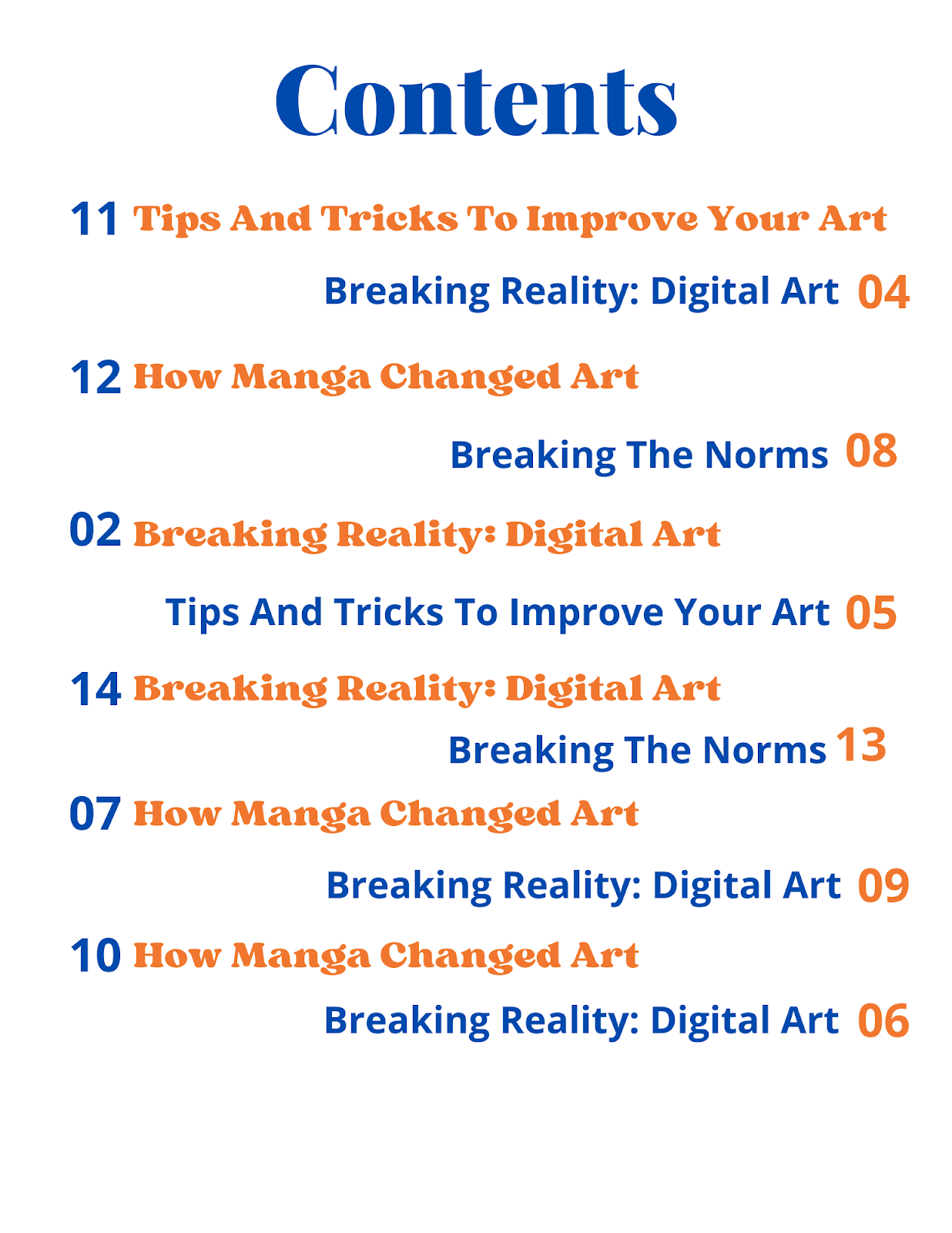
them from blending and gives them more definition and style. Since, my cover, introduces 3 main articles inside the magazine. I decided to include these coverlines in my table of contents. The article titles are, "Breaking The Norms", "Breaking Reality: Digital Art", and "How Manga Changed Art." I
was able to achieve this by, inserting my coverlines, in front of the
pieces/photos that are going to be introduced in these articles. This is
really efficient, as it helps the reader correlate which piece art is
featured in which article. This also gives the reader the freedom, to
chose which article they want to look first, judging by the piece of art
that is featured in the article. I inserted random page numbers for the
articles, as this aligns with the conventions of an art magazine. Keep
in mind, a magazine isn't just about articles and images, as many famous
magazines have to feature ads, in order to recieve money from their
sponsors. Another reason why I inserted random page numbers, is to keep
the reader excited and wanting for more. As, If these page numbers were
in chrnological order, than the reader would most likely be bored by the
magazine, after just reading one article. So, in order to avoid this, I
inserted random page numbers which will not only increase the time a
person reads the magazine, but will also give them a new perspective and
keep them interested. Laslty, random page numbers also add a creative
flare to the table of contents, in order to make it more appealing and
interesting.
Tools And Sources:
Canva, Canva. “Collaborate & Create Amazing Graphic Design for Free - CANVA.” Canva, Canva, 2013, https://www.canva.com/.
C, Aditya. “Cover Photo Editing/Selection.” Cover Photo Editing/Selection, Blogger, 12 Feb. 2022, https://adityachhabria.blogspot.com/2022/02/cover-photo-editingselection.html.
C, Aditya. “TOC Images and Original Content.” TOC Images and Original Content, Blogger, 19 Feb. 2022, https://adityachhabria.blogspot.com/2022/02/toc-images-and-original-content.html.
Fussell, Grace. “10 Tips for Designing High-Impact Magazines.” Design & Illustration Envato Tuts+, Envato Tuts, 15 June 2020, https://design.tutsplus.com/articles/10-tips-for-designing-high-impact-magazines--cms-25956.


Comments
Post a Comment