TOC Genre Analysis and Plans/Drafts
What Is A Table Of Contents?
Table of contents is often considered to be one of the most unspectacular design elements ever invented. Because of its simple, usual form, table of contents is often not given the attention it may deserve — after all, it is just a list of the parts of a book or document organized in the order in which the parts appear.
One of the pivotal aspects of magazine content structure is the table of contents (TOC). The TOC serves as the outline of the issue content. It’s a central reference for the content in the magazine issue. It’s not just a formality or an afterthought. The TOC is where the reader finds their way to what they care most about.
A great TOC reflects the true and intended magazine content structure for that issue. The TOC has sections with clearly-defined names, as well as the article name and the article subheading (if there is one). Magazine designers make the article references logical within the article file, by using different font sizes, like this:
When might you be required to formulate a table of contents? The first is a formal essay for school, depending on the length of the work. For example, if writing an in-depth, multi-page essay or a master's thesis, a table of contents will add an air of professionalism to your writing. On the other hand, if this is a short, five-paragraph essay on the history of the Galapagos Islands, a table of contents will not be necessary.

The Table Of Contents are also included in many magazines, textbooks, and novels. Think about it. How many times have we flipped open a magazine and searched the table of contents for pertinent material? Likewise, when reading a travel or an art magazine, a table of contents allows the readers to jump around to the sections that interest them the most.
The first decision magazine designers have to make is a matter of depth. How detailed does the TOC want (or need) to be? Will a broad chapter summation work? Or, will the magazine designer want to offer various subsections, too?
Let's begin in the broadest sense. Here, we have a single level table of contents for individual sections of the work, or individual chapters. A series of dots are included in order to make it easier for the reader's eye to note the corresponding page number.

Given that the contents above covers an expansive array of information, magazine designers might want to break some of those sections into subsections. The formatting for that would be as follows:

Magazine designers include as many subheadings as they need. If they want go in-depth into the various types of articles, spreads, and photos, then they include each type as its own subheading.
Just note that, while the table of contents is meant to direct the readers, mgazine designers only want to highlight the most important sections. Too many levels can make things unnecessarily complex, voiding the purpose of the table of contents. A multi-level table of contents would look something like:

Let's look at a table of contents specific to academic writing. The above contents can work for academic writing or novel writing. Often, in academic writing, each heading is numbered and labeled. Of course, a writer may want to check for samples based upon their preferred style of writing, like AP Style, MLA, or Chicago Manual of Style.
If the writer is submitting their paper electronically, they will most likely link each section to the appropriate page number, allowing readers to jump right to that section with a click of the mouse. As a rough estimation, a table of contents for an essay might look something like this:


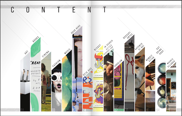
Once the reader opens up the magazine, the contents page will be their first port of call. The contents page should be functional and allow the reader to find sections and articles easily, but it’s also the perfect place to exercise a bit of stylistic creativity. If the magazine has a large amount of content, don’t restrict its contents to one page—branch out into a full two-page spread. As this gives plenty of room to introduce a large ‘Contents’ header (try out a slab serif for high-impact typography) and lots of enticing images. All great table of contents magazine spreads will be structured on some sort of grid layout, but it certainly doesn’t need to be boring and dull. Restricting the number of articles highlighted in each row or column of the grid, will give more breathing space to each item and will help maximize white space in the layout. When I was desigining the magazine, I focused more of my energy on making the contents page as well-structured and well-styled as possible. As it is the reference spread for the rest of the publication, so I wanted to make a good impression! I also used some lift typography styles and colors from the contents spread in order to develop a consistent look across the whole magazine. Remember that contents pages for magazines are very different to contents pages for books or reports. Magazine contents are full of enticing images and exciting typography, in order to get the reader in the mood for delving into the rest of the magazine’s content. Lastly, I am leaning towards my fourth sketch to be my final table of contents, as this table of contents will incorporate bright and vivid images, while including clear and defined text. The text will be needed, in order for the reader to naviagate through the magazine. Since, this table of contents is going to have both, images and text, it follows the conventions of an art magazine. The images in this table of contents, will be placed in a very creative way, so that the reader can see what art is being featured, while looking through the content, in order to find the article they want. I have also included the page numbers on top of the images, so that the reader can easily find, which art is being featured on which page. The fonts that are going to be used in this table of contents, will be a mix of serif and sans-serif, as this will make the subtitles/text very defined, powerful and impactful. I will be using serif fonts for the contents below the subtitles, as that will make the contents more cleaner, visually appealing and easier to read. The positioning of the images is going to correlate with the positioning of the content, as if I had made the images a little bigger or placed them right in the middle, then there would be no place for the text, as the table of contents itself would be very difficult to navigate. But, since I am giving different positions for my images, the text will fit perfectly.
Banionis, Vee. “Get Your Magazine Issue Content Prep Right!” Flip180 LLC, 4 Sept. 2020, https://www.flip180media.com/tips-for-periodical-publishers/magazine-content-structure-guide/.
Kittelstad, Kit. “Table of Contents Examples.” Examples, https://examples.yourdictionary.com/reference/examples/table-of-content-examples.html.
Fussell, Grace. “10 Tips for Designing High-Impact Magazines.” Design & Illustration Envato Tuts+, Envato Tuts, 15 June 2020, https://design.tutsplus.com/articles/10-tips-for-designing-high-impact-magazines--cms-25956.
Friedman, Vitaly, et al. “Table of Contents: Creative Examples.” Smashing Magazine, 7 July 2008, https://www.smashingmagazine.com/2008/07/table-of-contents-creative-and-beautiful-examples/#:~:text=Because%20of%20its%20simple%2C%20usual,in%20which%20the%20parts%20appear.&text=This%20post%20showcases%20creative%20and%2For%20beautiful%20tables%20of%20contents.


Comments
Post a Comment