Planning the 2-pg Spread Layout
Digital Layout #1

This is the first digital layout of my 2-page spread for my Art magazine. Firstly, the section head is placed on the top of the 2-page spread, so that the reader can easily identify which category this article/spread is from. This gives the reader an opportunity to select which category is their favorite, and helps them locate their favorite article more efficiently and effectively. Section/Running heads are usually placed at the top of every page of a magazine and aid readers in navigating through an article easily. A running head should be designed creatively so that it looks good, because it is present on almost all pages of the magazine and a reader sees it every now and then. So, it has to be visually attractive. The headline is then placed on the right side of the image, so that the reader can clearly see what the article is about. Headlines are the most important element of a magazine layout design. It can be of various sizes, but should be set in a size bigger than the other text elements in the page. A headline should be interesting, meaningful and compelling enough as it increases the chances of an article to be read. The subhead is then placed right below the headline, so that the reader is kept interested in the 2-page spread. The subhead also gives specific information about the article. Subheads are used to break an article into various sections or compartments, indicating what the next set of paragraphs is going to talk about. It can be written in the same font in which the body copy is written, but it should stand out from the body copy at the same time. Hence, magazine designers keep it "bold" so that it looks like a mini-heading or headline. An important thing to bear in mind is that you should not place subheads below an image or a quote in an article. Right below that, is the introductory paragraph, which introduces the reader to the art pieces being featured and the articles themselves. The introductory paragraph will include a drop cap, as they are a part of my Art magazine conventions, and are also used by magazine designers, in order to make the text less boring, and give it more style and personality. Introductory Paragraphs are also known as "intro" "kicker", "deck" or "stand-first", an introductory paragraph is the main piece of content that introduces a reader to an article. It carries forward what a headline has succeeded in doing - catching the attention of a reader. It connects a reader to the main article, taking forward a reader's journey into the midst of the article. It sets the tone of the article for a reader and sometimes, also summarizes the entire article. In terms of font size, it should be smaller than the font size of the headline of an article. But, it should be slightly bigger or at least a little bolder than the rest of the article. Each article has its own subhead, as each of them go in-depth about the different types of art pieces being featured. Then, there is the body text, right below the subhead, which will talk about the deeper meanings behind these art pieces and will also give a brief explanation behind their creation. Body copies/texts are a more lengthy and detailed part of a magazine article when compared to the introductory paragraph of the heading / headline of an article. A well-written body copy keeps a reader engaged to an article for the most part, generally till the end of the article. When one begins to design the magazine layout template, they should begin with designing the body copy of an article, because that takes maximum space, running into multiple paragraphs. Magazine designers set the right margins in terms of columns and rows to improve readability. A key point to note here is that magazine designers are consistent with the length of the body copy for all the articles in the magazine. Next, are the captions, which are placed on the right, left and below their respective images. The captions are most likely going to be interactive questions and facts about the art pieces featured. These captions are responsible for keeping the reader interested in the 2-page spread, and make it more informational in a fun and appealing way. Captions are written in a way that they complement the image being used in an article. A caption should describe an image and should ideally be placed immediately below the image. The font size for image captions can be the same as that of the font in which the body copy has been written or slightly smaller than that. Then, there is a pull quote, which is placed between the 2 art piece images and is on the right side of the 2-page spread. The pull quote is also responsible for keeping the reader interested, but what makes them different from the captions is that, they are direct quotes from the artists that created the art pieces being featured, giving the reader an idea about their personality and style, while being short, concise and attention-grabbing. Pull Quotes usually provide a different dimension to an article in a magazine, making it look more interesting. Quotes aid in conveying your story to a reader, and if coupled with images, become potent. You can either have a quote verbatim from a portion of the body copy, or you could perhaps summarize a few points of the body copy in different words and have them as a quote or an excerpt. Ideally, the quotes or excerpts or blurbs should be in a font that is different from the font in which the body copy has been written. Laslty, there is the page number and the byline, which are always placed in the bottom corner of a 2-page spread. The page numbers are responsible for maintaining the continuity of the magazine, while giving the reader an idea about which page number they are on and the total number of pages in the magazine. The page numbers also give the reader an opportunity to easily and efficiently look for their desired section and article, whose page numbers are already included in the magazine table of contents. Folios/page numbers are designed in such a way that you do not annoy a reader who looks into it on almost every page of a magazine. It is a way of arranging sheets of papers in your magazine, by folding them in a certain manner. Magazine designers tread with caution especially when they have many pages in your magazine containing full bleed images. A reader could be annoyed if you place folios on those pages. The purpose of the bylines is to credit the magazine company, website, or designer. It is very important to give them credit, as the magazine company is the one that is funding the production of the magazine in the first place. Bylines are important as they acknowledge the person and the team which has worked on an article. Usually, the author's name is written under the headline of the article, which is also known as the byline. It can be written in the same font size as that of the body text.
Digital Layout #2

This is the second digital layout of my 2-page spread for my Art magazine. The positioning of all my images have been changed from my first digital layout. Firstly, the section head is placed on the top of the 2-page spread, so that the reader can easily identify which category this article/spread is from. This gives the reader an opportunity to select which category is their favorite, and helps them locate their favorite article more efficiently and effectively. Section/Running heads are usually placed at the top of every page of a magazine and aid readers in navigating through an article easily. A running head should be designed creatively so that it looks good, because it is present on almost all pages of the magazine and a reader sees it every now and then. So, it has to be visually attractive. The headline is then placed on the right side of the image, so that the reader can clearly see what the article is about. Headlines are the most important element of a magazine layout design. It can be of various sizes, but should be set in a size bigger than the other text elements in the page. A headline should be interesting, meaningful and compelling enough as it increases the chances of an article to be read. The subhead is then placed right below the headline, so that the reader is kept interested in the 2-page spread. The subhead also gives specific information about the article. Subheads are used to break an article into various sections or compartments, indicating what the next set of paragraphs is going to talk about. It can be written in the same font in which the body copy is written, but it should stand out from the body copy at the same time. Hence, magazine designers keep it "bold" so that it looks like a mini-heading or headline. An important thing to bear in mind is that you should not place subheads below an image or a quote in an article. Right below that, is the introductory paragraph, which introduces the reader to the art pieces being featured and the articles themselves. The introductory paragraph will include a drop cap, as they are a part of my Art magazine conventions, and are also used by magazine designers, in order to make the text less boring, and give it more style and personality. Introductory Paragraphs are also known as "intro" "kicker", "deck" or "stand-first", an introductory paragraph is the main piece of content that introduces a reader to an article. It carries forward what a headline has succeeded in doing - catching the attention of a reader. It connects a reader to the main article, taking forward a reader's journey into the midst of the article. It sets the tone of the article for a reader and sometimes, also summarizes the entire article. In terms of font size, it should be smaller than the font size of the headline of an article. But, it should be slightly bigger or at least a little bolder than the rest of the article. Each article has its own subhead, as each of them go in-depth about the different types of art pieces being featured. Then, there is the body text, right below the subhead, which will talk about the deeper meanings behind these art pieces and will also give a brief explanation behind their creation. Body copies/texts are a more lengthy and detailed part of a magazine article when compared to the introductory paragraph of the heading / headline of an article. A well-written body copy keeps a reader engaged to an article for the most part, generally till the end of the article. When one begins to design the magazine layout template, they should begin with designing the body copy of an article, because that takes maximum space, running into multiple paragraphs. Magazine designers set the right margins in terms of columns and rows to improve readability. A key point to note here is that magazine designers are consistent with the length of the body copy for all the articles in the magazine. Next, are the captions, which are placed on the right, left and below their respective images. The captions are most likely going to be interactive questions and facts about the art pieces featured. These captions are responsible for keeping the reader interested in the 2-page spread, and make it more informational in a fun and appealing way. Captions are written in a way that they complement the image being used in an article. A caption should describe an image and should ideally be placed immediately below the image. The font size for image captions can be the same as that of the font in which the body copy has been written or slightly smaller than that. Then, there is a pull quote, which is placed between the 2 art piece images and is on the right side of the 2-page spread. The pull quote is also responsible for keeping the reader interested, but what makes them different from the captions is that, they are direct quotes from the artists that created the art pieces being featured, giving the reader an idea about their personality and style, while being short, concise and attention-grabbing. Pull Quotes usually provide a different dimension to an article in a magazine, making it look more interesting. Quotes aid in conveying your story to a reader, and if coupled with images, become potent. You can either have a quote verbatim from a portion of the body copy, or you could perhaps summarize a few points of the body copy in different words and have them as a quote or an excerpt. Ideally, the quotes or excerpts or blurbs should be in a font that is different from the font in which the body copy has been written. Laslty, there is the page number and the byline, which are always placed in the bottom corner of a 2-page spread. The page numbers are responsible for maintaining the continuity of the magazine, while giving the reader an idea about which page number they are on and the total number of pages in the magazine. The page numbers also give the reader an opportunity to easily and efficiently look for their desired section and article, whose page numbers are already included in the magazine table of contents. Folios/page numbers are designed in such a way that you do not annoy a reader who looks into it on almost every page of a magazine. It is a way of arranging sheets of papers in your magazine, by folding them in a certain manner. Magazine designers tread with caution especially when they have many pages in your magazine containing full bleed images. A reader could be annoyed if you place folios on those pages. The purpose of the bylines is to credit the magazine company, website, or designer. It is very important to give them credit, as the magazine company is the one that is funding the production of the magazine in the first place. Bylines are important as they acknowledge the person and the team which has worked on an article. Usually, the author's name is written under the headline of the article, which is also known as the byline. It can be written in the same font size as that of the body text.
Digital Layout #3
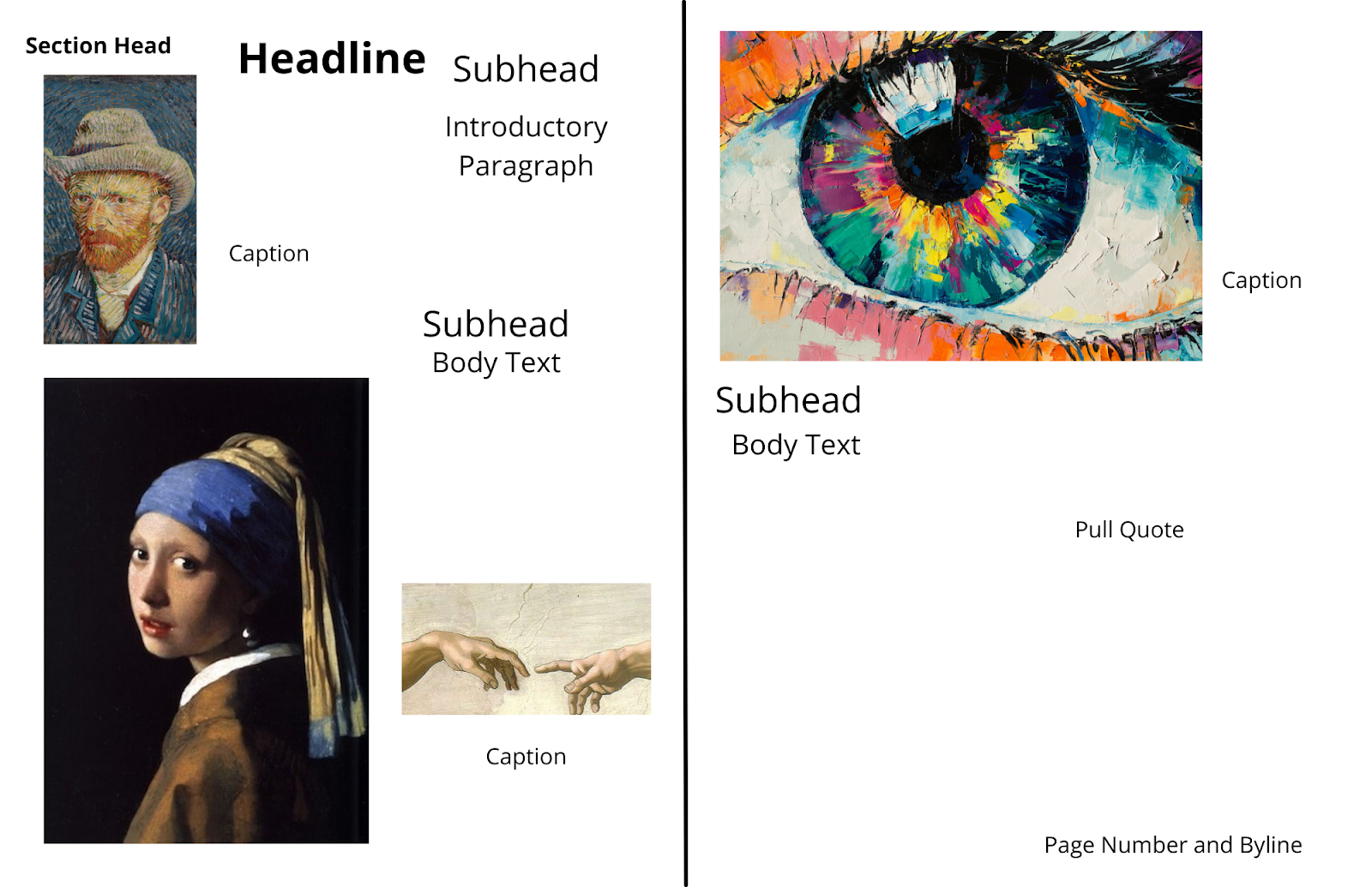
This is the third digital layout of my 2-page spread for my Art magazine. The positioning of all my images have been changed from my first and second digital layouts. Firstly, the section head is placed on the top of the 2-page spread, so that the reader can easily identify which category this article/spread is from. This gives the reader an opportunity to select which category is their favorite, and helps them locate their favorite article more efficiently and effectively. Section/Running heads are usually placed at the top of every page of a magazine and aid readers in navigating through an article easily. A running head should be designed creatively so that it looks good, because it is present on almost all pages of the magazine and a reader sees it every now and then. So, it has to be visually attractive. The headline is then placed on the right side of the image, so that the reader can clearly see what the article is about. Headlines are the most important element of a magazine layout design. It can be of various sizes, but should be set in a size bigger than the other text elements in the page. A headline should be interesting, meaningful and compelling enough as it increases the chances of an article to be read. The subhead is then placed right below the headline, so that the reader is kept interested in the 2-page spread. The subhead also gives specific information about the article. Subheads are used to break an article into various sections or compartments, indicating what the next set of paragraphs is going to talk about. It can be written in the same font in which the body copy is written, but it should stand out from the body copy at the same time. Hence, magazine designers keep it "bold" so that it looks like a mini-heading or headline. An important thing to bear in mind is that you should not place subheads below an image or a quote in an article. Right below that, is the introductory paragraph, which introduces the reader to the art pieces being featured and the articles themselves. The introductory paragraph will include a drop cap, as they are a part of my Art magazine conventions, and are also used by magazine designers, in order to make the text less boring, and give it more style and personality. Introductory Paragraphs are also known as "intro" "kicker", "deck" or "stand-first", an introductory paragraph is the main piece of content that introduces a reader to an article. It carries forward what a headline has succeeded in doing - catching the attention of a reader. It connects a reader to the main article, taking forward a reader's journey into the midst of the article. It sets the tone of the article for a reader and sometimes, also summarizes the entire article. In terms of font size, it should be smaller than the font size of the headline of an article. But, it should be slightly bigger or at least a little bolder than the rest of the article. Each article has its own subhead, as each of them go in-depth about the different types of art pieces being featured. Then, there is the body text, right below the subhead, which will talk about the deeper meanings behind these art pieces and will also give a brief explanation behind their creation. Body copies/texts are a more lengthy and detailed part of a magazine article when compared to the introductory paragraph of the heading / headline of an article. A well-written body copy keeps a reader engaged to an article for the most part, generally till the end of the article. When one begins to design the magazine layout template, they should begin with designing the body copy of an article, because that takes maximum space, running into multiple paragraphs. Magazine designers set the right margins in terms of columns and rows to improve readability. A key point to note here is that magazine designers are consistent with the length of the body copy for all the articles in the magazine. Next, are the captions, which are placed on the right, left and below their respective images. The captions are most likely going to be interactive questions and facts about the art pieces featured. These captions are responsible for keeping the reader interested in the 2-page spread, and make it more informational in a fun and appealing way. Captions are written in a way that they complement the image being used in an article. A caption should describe an image and should ideally be placed immediately below the image. The font size for image captions can be the same as that of the font in which the body copy has been written or slightly smaller than that. Then, there is a pull quote, which is placed between the 2 art piece images and is on the right side of the 2-page spread. The pull quote is also responsible for keeping the reader interested, but what makes them different from the captions is that, they are direct quotes from the artists that created the art pieces being featured, giving the reader an idea about their personality and style, while being short, concise and attention-grabbing. Pull Quotes usually provide a different dimension to an article in a magazine, making it look more interesting. Quotes aid in conveying your story to a reader, and if coupled with images, become potent. You can either have a quote verbatim from a portion of the body copy, or you could perhaps summarize a few points of the body copy in different words and have them as a quote or an excerpt. Ideally, the quotes or excerpts or blurbs should be in a font that is different from the font in which the body copy has been written. Laslty, there is the page number and the byline, which are always placed in the bottom corner of a 2-page spread. The page numbers are responsible for maintaining the continuity of the magazine, while giving the reader an idea about which page number they are on and the total number of pages in the magazine. The page numbers also give the reader an opportunity to easily and efficiently look for their desired section and article, whose page numbers are already included in the magazine table of contents. Folios/page numbers are designed in such a way that you do not annoy a reader who looks into it on almost every page of a magazine. It is a way of arranging sheets of papers in your magazine, by folding them in a certain manner. Magazine designers tread with caution especially when they have many pages in your magazine containing full bleed images. A reader could be annoyed if you place folios on those pages. The purpose of the bylines is to credit the magazine company, website, or designer. It is very important to give them credit, as the magazine company is the one that is funding the production of the magazine in the first place. Bylines are important as they acknowledge the person and the team which has worked on an article. Usually, the author's name is written under the headline of the article, which is also known as the byline. It can be written in the same font size as that of the body text.
Summary
In conclusion, my Art genre, digital layout 2-page spreads, contain the following 9 elements, which are: Headlines, Introductory Paragraphs, Body text/copy, Bylines, Subheads, Pull Quotes, Captions, Section/Running heads, and Folios/Page numbers. Headlines are the most important element of a magazine layout design. It can be of various sizes, but should be set in a size bigger than the other text elements in the page. A headline should be interesting, meaningful and compelling enough as it increases the chances of an article to be read. Introductory Paragraphs are also known as "intro" "kicker", "deck" or "stand-first", an introductory paragraph is the main piece of content that introduces a reader to an article. It carries forward what a headline has succeeded in doing - catching the attention of a reader. It connects a reader to the main article, taking forward a reader's journey into the midst of the article. It sets the tone of the article for a reader and sometimes, also summarizes the entire article. In terms of font size, it should be smaller than the font size of the headline of an article. But, it should be slightly bigger or at least a little bolder than the rest of the article. Body copies/texts are a more lengthy and detailed part of a magazine article when compared to the introductory paragraph of the heading / headline of an article. A well-written body copy keeps a reader engaged to an article for the most part, generally till the end of the article. When one begins to design the magazine layout template, they should begin with designing the body copy of an article, because that takes maximum space, running into multiple paragraphs. It is important that you set the right margins in terms of columns and rows to improve readability. A key point to note here is that you should be consistent with the length of the body copy for all the articles in the magazine. Bylines are important as they acknowledge the person and the team which has worked on an article. Usually, the author's name is written under the headline of the article, which is also known as the byline. It can be written in the same font size as that of the body copy. Subheads are used to break an article into various sections or compartments, indicating what the next set of paragraphs is going to talk about. It can be written in the same font in which the body copy is written, but it should stand out from the body copy at the same time. Hence, you can keep it "bold" so that it looks like a mini-heading or headline. An important thing to bear in mind is that you should not place subheads below an image or a quote in an article.Pull Quotes usually provide a different dimension to an article in a magazine, making it look more interesting. Quotes aid in conveying your story to a reader, and if coupled with images, become potent. You can either have a quote verbatim from a portion of the body copy, or you could perhaps summarize a few points of the body copy in different words and have them as a quote or an excerpt. Ideally, the quotes or excerpts or blurbs should be in a font that is different from the font in which the body copy has been written. Captions are written in a way that they complement the image being used in an article. A caption should describe an image and should ideally be placed immediately below the image. The font size for image captions can be the same as that of the font in which the body copy has been written or slightly smaller than that. Section/Running heads are usually placed at the top of every page of a magazine and aid readers in navigating through an article easily. A running head should be designed creatively so that it looks good, because it is present on almost all pages of the magazine and a reader sees it every now and then. So, it has to be visually attractive. Folios are designed in such a way that you do not annoy a reader who looks into it on almost every page of a magazine. It is a way of arranging sheets of papers in your magazine, by folding them in a certain manner. Magazine designers tread with caution especially when they have many pages in thier magazine containing full bleed images. A reader could be annoyed if they place folios on those pages.
Tools And Sources:
Art, Scholastic. “Jan/Feb 2022 Issues – Articles, Activities, and Videos: Scholastic Art Magazine.” Scholastic Art, Scholastic Art, 2 Mar. 2022, https://art.scholastic.com/issues/2021-22/010122.html.
C, Aditya. “2-PG Spread - Voice, Language and Audience.” 2-Pg Spread - Voice, Language and Audience, Blogger, 10 Mar. 2022, https://adityachhabria.blogspot.com/2022/03/2-pg-spread-voice-language-and-audience.html.
Franz, Laura. “Drop Caps: Historical Use and Current Best Practices with CSS.” Smashing Magazine, Articles, 4 Apr. 2012, https://www.smashingmagazine.com/2012/04/drop-caps-historical-use-and-current-best-practices/.
2India, Outsource. “10 Key Elements of a Magazine Layout Design - outsource2india.” Outsource to India, Outsource 2 India, 9 Mar. 2022, https://www.outsource2india.com/creative-services/articles/10-key-elements-magazine-layout-design.asp.
Canva, Canva. “Collaborate & Create Amazing Graphic Design for Free - CANVA.” Canva, Canva, 2013, https://www.canva.com/.


Comments
Post a Comment